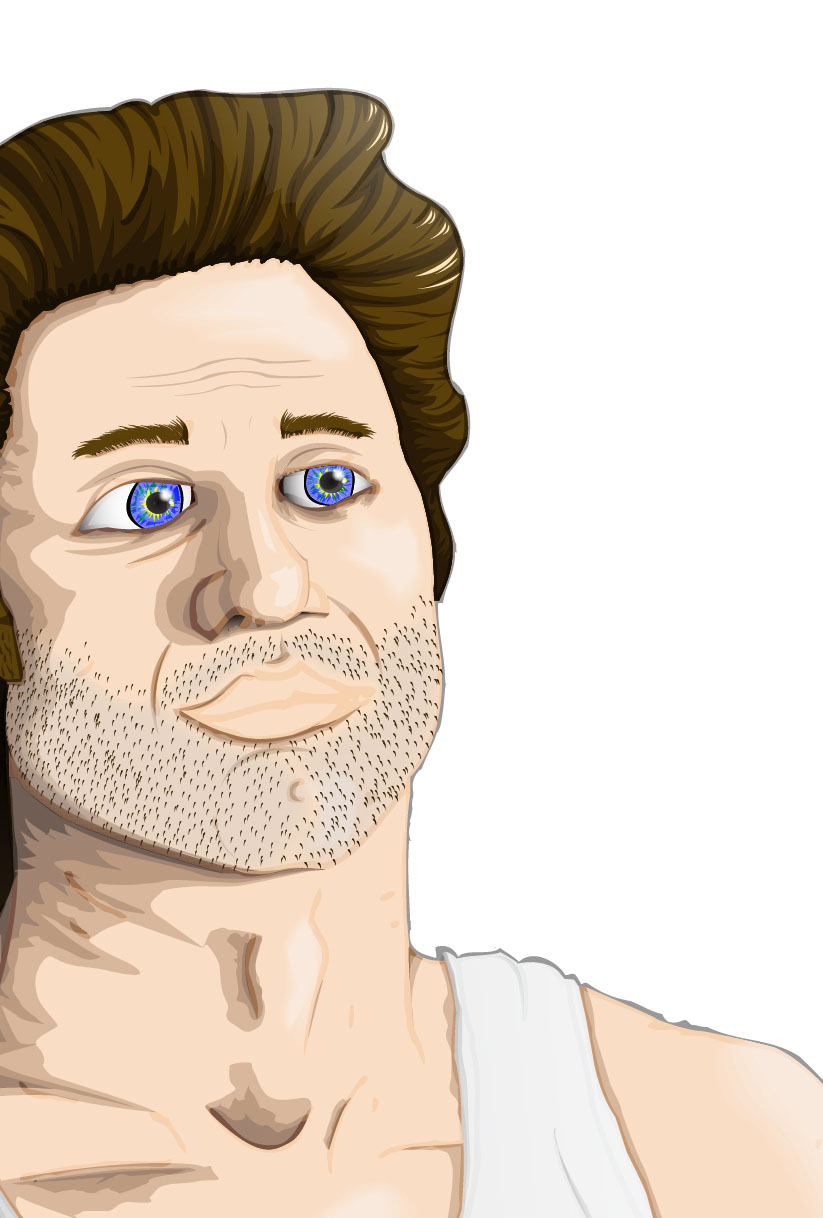
After ages of fussing and faffing with colours and different fills and such, I decided to just cut the crap, keep it simple, 2 colour print on white. Gonna screen this, then I'll post the outcome.
Showing posts with label vector. Show all posts
Saturday, 24 November 2012
The Butcher - Complete
Labels:
art,
Ben Mercer,
Bournemouth,
butcher,
Design,
Drawing,
Illustration,
Illustrator,
t shirt,
vector
Monday, 13 August 2012
Raised By Foxes - Coloured
Labels:
Ben Mercer,
big hair,
company,
Design,
draw,
Drawing,
face,
feathers,
fox,
Girl,
Illustration,
Illustrator,
Personal Work,
print,
raised by foxes,
screen printing,
t shirt,
vector
Sunday, 22 April 2012
EMP Poster 3: Small Town Folk
No messing around with this one. Get it done. Took my inspiration for various other horror movie posters where the killer is visable in centre frame but is obscured in some way, either by their back being turned or something hiding them to leave some suspense to finding out what they look like. I went for a simple fade out on three edges and the sickle coming forward on the right. I went for a simple colour palette this time. After creating two heavily coloured and heavily detailed posters I felt that I needed to try my hand at something a little more refined. White, grey, black, two shades of blue, red & a flare. I sat the figure on a black background to allow the fade. The typography again is the same in terms of the information text and the title typeface is Arno Pro (display) which is close to the typeface used in the original artwork. I chose to use only a single splash of red so that it really stands out from the rest of the image, it can be easy to use too much red which ruins the balance of a piece and I wanted to keep it minimal and suggestive rather than painting blood all over the place.
Monday, 16 April 2012
EMP Poster 1: Big Trouble In Little China - Finally Finished
This has been, without a doubt, the most extensive period of time spent on a single illustration I've ever done. According to my blog record I posted the first character for this on the 30/01/12, and that took a few days in itself. So I've been working on this for nearly 3 months and it is finally finished and I am SO glad. I've added in the Kim Cattrall character (You have to have a woman in the poster somewhere. It's a rule.) and I've dropped the guardian simply because of the logistics of fitting him into the frame. Because of his shape he was being really awkward and wasn't fitting properly with any of the other characters and was throwing out the whole balance of the image so in the end I had to cut him from the final piece. I went with a black background & blended that into the bottom of the characters.
I also abandoned the hand-made text I had after some feedback regarding its inaccuracy and general shoddiness. I tried to keep the typeface as close to the original movie posters/cover as possible as I think it's a fairly iconic part of the imagery for this particular film. So I used the same colour gradient with the same stroke for the lettering. The typeface used for the title is Big Noodle Titling (which frankly sounds like it was made for this piece anyway) which was close enough to the original to be similar but not so 80's as to look as tacky. The typefaces used for the information at the bottom are OSP - DIN ( my favourite that I use on everything ) and I wanted another sans-serif to compliment it and after trying a bunch ended up with Trebuchet. ( I think that's how it's spelt. ) I like the effect that using different weights and sizes of the same font within a line has; I think it really helps to emphasise certain words without being too distracting or breaking the flow. These two typefaces and positioning of the information will be constant across all my posters to create a sense of them being a set.
Overall I'm really happy with the final outcome of this poster. I think that the illustrations have all joined together well to create a strong, balanced image that holds its own but is supported by the typography. I wanted to do justice to the original imagery used and I think that by taking elements of the compositional style and typography that I have managed to do so whilst bringing in my own take on the characters.
Enough talking.
Here's a picture.
I can't wait until this is blown up to A1.
I also made a tiny body-bag as packaging for my Small Town Folk vinyl today. But it's not quite finished so I'll hold off on the imagery for now.
Labels:
alamo drafthouse,
Ben Mercer,
big trouble,
Design,
Drawing,
EMP,
Exploding,
film,
Illustration,
Illustrator,
james hong,
kurt russell,
lightning,
little china,
movie,
Poster,
storm,
Uni,
vector
Wednesday, 11 April 2012
EMP Poster 1: Big Trouble In Little China - The Third Storm
The third storm.
They all wear the same hats. Just one more vector character to do. Then possibly background. And typography. And composition.
I finished my A1 Troll Hunter illustration today. That's likely to be up tomorrow.
Labels:
Ben Mercer,
big trouble,
Chinese,
Design,
Drawing,
film,
hat,
Illustration,
Illustrator,
lightning,
little china,
Poster,
rain,
storm,
thunder,
vector,
wicker
Friday, 6 April 2012
Thursday, 22 March 2012
EMP Poster 1: Big Trouble In Little China - The Guardian
Sees All, Knows All.
The Guardian.
Squishy ball man with an eyeball in his mouth and tubes and things. Looking at this now the eye in the mouth needs sorting out but it's being fiddly and I can't make it work.
Labels:
art,
Ben Mercer,
big trouble,
Design,
Drawing,
EMP,
eyeballs,
guardian,
Illustration,
Illustrator,
little china,
Poster,
Uni,
vector
Wednesday, 21 March 2012
EMP Poster 1: Big Trouble In Little China - Wicker Hat Man #2
The second Storm from Big Trouble In Little China. It's all about enormous wicker hats.
I'm not as happy with this one as with the other characters, I may go back and re-work a lot of the detail and colouring. Just seems to be lacking something, maybe I forgot something. Don't know. I used the same colours for the face as the last Storm to keep it consistent. Next up I've got the third Storm to illustrate, then the guardian. Also I'm going to start work on my Troll Hunter poster and I'm halfway through painting my vinyl figure of James Hong. Photos to follow.
Labels:
Ben Mercer,
big trouble,
Design,
Drawing,
EMP,
film,
hat,
Illustration,
Illustrator,
lightning,
little china,
movie,
Poster,
rain,
storm,
thunder,
Uni,
vector,
wicker
Thursday, 8 March 2012
Friday, 24 February 2012
EMP Poster 1: Big Trouble In Little China - Crazy Statue
Illustration part 5 for my first movie poster:
A weird glowing statue that's in the background.

Labels:
Ben Mercer,
big trouble,
buddha,
Design,
Drawing,
EMP,
fat,
Illustration,
Illustrator,
little china,
six arms,
skull,
statue,
Uni,
vector
Tuesday, 21 February 2012
EMP Poster 1: Big Trouble In Little China - Exploding-Fat-Head-Guy
You've never seen anyone with a head this fat.
For those unfamiliar with the movie, there is a scene where a guy swells up and then his head explodes.
For the final poster some streams of smoke coming out of his nostrils will be added.
Labels:
Ben Mercer,
big trouble,
Design,
Drawing,
fat,
green eyes,
head,
Illustration,
Illustrator,
little china,
man,
Poster,
teeth,
Uni,
vector
Thursday, 16 February 2012
Monday, 13 February 2012
Monday, 30 January 2012
EMP Poster 1: Big Trouble In Little China - James Hong
EMP (extended major project) has begun.
I am producing a series of highly detailed, illustration movie posters for some weird and wonderful movies.
The first I picked was 'Big Trouble In Little China'.
Here's part 1 - James Hong.
Close up.
Full.
Gradient, blend & a lot of time on illustrator.
Next: Kurt Russell.
Labels:
Ben Mercer,
big trouble,
Design,
Drawing,
EMP,
film,
hat,
Illustration,
Illustrator,
james hong,
little china,
lo pan,
movie,
nails,
Poster,
Uni,
vector
Monday, 31 October 2011
'Dear Godmachine' Or 'Dead By Dawn'
Finally finished.
This probably took the longest out of anything I've done this year.
Loving the little extras here and there & definitely need to get involved more with that typeface.
Labels:
Ben Mercer,
cross,
crucifix,
dawn,
Dead,
Drawing,
green eyes,
Gypsy Head,
heart,
Illustration,
Illustrator,
leaf,
red head,
skull,
tears,
teeth,
vector
'Dear Godmachine' - Work In Progress 3
It's getting fairly large now and is taking ages to do anything.
More colours. More additions. More more more.
Labels:
Ben Mercer,
big hair,
cross,
crucifix,
Drawing,
godmachine,
gypsy,
Illustration,
Illustrator,
leaf,
red head,
skull,
spine,
Tattoo,
vector
Saturday, 22 October 2011
'Dear Godmachine' - Work In Progress 2
I've been busy a-vectoring.
I know using flares is a sin. But I like them sometimes.
Still a lot of work to do here.
Eyes, more colouring layers on the face, teeth, cross details, more colouring on the hair, gradients on the swirls, background, extras. Stay tuned.
Labels:
Ben Mercer,
big hair,
cross,
crucifix,
Drawing,
flare,
godmachine,
green eyes,
gypsy,
Gypsy Head,
Illustration,
Illustrator,
Personal Work,
red head,
skull,
teeth,
vector
Sunday, 16 October 2011
Year 3 - Project 2: The Future Of Illustration Part 1 - The iSlab
6 day project to 'imagine where Visual Communication might be in 2022' focusing on illustration.
Didn't initially like the brief, but once I started getting some ideas on the go it became enjoyable.
Here's the first one I've put together. It's an A2 tablet used for drawing that essentially would allow you to create piece that look genuinely hand drawn in a digital format by having paper texture settings and things like that. More info on the image.
I have no affiliation with Apple, iPod or iPad. There are no plans to put this product, or anything similar, into production as far as I am aware. Just in case anyone gets confused. Although it would be fun to start a rumour that Apple are bringing this out.
Labels:
apple,
Ben Mercer,
Drawing,
future,
Illustration,
Illustrator,
iSlab,
paint,
tablet,
third year,
Uni,
vector
Monday, 10 October 2011
Year 3 - Project 1: VisCom Poster - Work In Progress
Back to uni for my 3rd year of Visual Communication.
The first project out of the bag is to create an A3 poster which promotes VisCom to prospective students whilst delivering both my own take on the course and also presenting my specialism. Obviously illustration is my specialism so the only thing left to do was come up with my take on the course. After some thinking I came up with "Difficult But Ultimately Rewarding." To me that pretty much sums it up. Here's what I'm working on.
Musk Oxen. Ox's are stubborn and therefore represent difficulty.
Vector Musk Oxen.

With a side order of diamonds to represent the reward.
More to follow.
Labels:
Ben Mercer,
Design,
diamond,
Drawing,
Illustration,
Illustrator,
musk,
ox,
oxen,
Poster,
shadow,
third year,
Uni,
vector
Subscribe to:
Posts (Atom)