Showing posts with label Dead. Show all posts

Thursday, 25 October 2012

The Butcher - Work in progress.

So here's a little peak at an idea I started working on this evening. More to follow.


Wednesday, 11 January 2012

Monday, 19 December 2011

For Asgard - Finished

Many layers. Many textures. Many brushes.

It's taken some time for me to accept the validity of Photoshop for anything other than photo editing.
I'm coming round but I think I still prefer Illustrator. 

Tuesday, 13 December 2011

For Asgard - Work In Progress

Basically I watched Thor and then decided to do a drawing. 
One informed the other. Went pretty heavy on the hatching.
Next step colour, and sorting out the dodgy lettering.

Wednesday, 9 November 2011

Los Muertos Y Sin Dios V.s. The Lost Soul


Getting down with The Dead And Godless. I love this typeface. I want to use it for everything. Logistically, stylistically and aesthetically that's either impossible or a really bad idea. But it'd be fun to try.


Lost soul.
Simple.
Take an older piece of work.
Vectorise it.
Introduce a black background.
 Add a set of tiny upside down crucifixes.
Put your web address at the bottom.
Send it to the printers.
Coming soon to www.mercerdrawsthings.bigcartel.com

Monday, 31 October 2011

'Dear Godmachine' Or 'Dead By Dawn'

Finally finished. 
This probably took the longest out of anything I've done this year. 
Loving the little extras here and there & definitely need to get involved more with that typeface.

Dead By Dawn Flash Sheet

Happy Halloween and all that. 
Weird flash-sheet-type-thing. For re-usable elements in vectors.


Monday, 5 September 2011

Dead Girls Don't Cry - Redo Again

The composition was still annoying me. I'll probably change it again in a couple of days.

Thursday, 1 September 2011

Love Is Blind - Work In Progress

Another sneak peak at a work in progress. Regular readers may recognise this one, it's a piece I did almost a year ago that I always wanted to do something else with but wasn't quite sure what. And after 'Dead Girls Don't Cry' the idea pretty much slapped me in the face. 


Nowhere near finished. Just about done working on the skin.

Tuesday, 30 August 2011

Dead Girls Don't Cry Poster

I don't know WHAT I was doing with the composition on yesterdays piece. I must of been knackered. As soon as I left it alone I realised how bad it was. Here's a new one. Threw in a little extra transparency and a rejiggle of elements. Also cleaned up a whole bunch of small overlap errors and areas where the strokes weren't quite right and stuff. Much better.


On a poster-print?


Monday, 29 August 2011

Dead Girls Don't Cry

This took all day. Lots of little bits of colour, gradients & transparencies. I'm not sure I'm totally happy with it, but I've spent 10 hours on it today and it's reached the point where I can't even tell if it's good or not because I've been staring at it for too long. There's loads of detail there if you want to zoom right in. Have a look see.

This on the other hand took no time at all but I thought it looked pretty cool.  

Dead Girl - Work In Progress

So here's a little peak at what I'm working on at the minute. It's taking forever and I wanted to post something.
Pretty much just done the skin at the moment. 

Wednesday, 5 January 2011

Back To Weaving The Dreams

So now that 2010 is done and dusted and all of my drawingly requirements are also done for now I had time to get back to what I supposed to be doing with my time: building my website. Filling up my gallerys was priority one. It took a long time to format 100 or so images and make thumbnails of them as well but it got done. It then also took a long time to insert aformentioned imagery into said gallerys in the requisite fashion and a pleasant order. Yes. That's right. Requisite. I chose a dead pigeon to be the fron of my illustration one because I like it. And that is the best reason to do anything and everything.

The next step was to input an animation into my website. Since I've only ever made one animation to date this was exceedingly easy. I simply clicked on a backing box and hit insert - media - swf - browse - file. Then resized it appropriately. At some point I'm sure that I will make some more animations in which case I will be forced to integrate them into a gallery system similar to that of my illustration gallery. But as it stands I have no need of such a system and this will be updated when necessary.


As you can see here, it works.


Then I realised that I hadn't actually put any imagery on my front page yet and It was in essence, a white box with a few bits of text sitting in it. It took me a while to decide what images to use. I didn't want to go for just one image as I think that this would narrow the field down too much and visitors to the site might think this is the only type of work that you do. So I went for a mixture of styles and disciples, focusing on illustration as this is my fortay. So I've got a colour illustration, a bold black and white one, a painted one and a line work one alongside a book cover design and a black and white photograph. I chose to focus the images in on a small detail as the larger images are available for viewing through the galleries. I think this works well as it creates an interesting composition, and a small insight into the variety of work that I produce. I chose to arrange them as below due to the fact that 3 of the images I chose to use were predominately green. So I split them up as much as possible.

Monday, 27 December 2010

December 27th 2010: Always Looking Dead


I think this is one of the best things I've done all year, and since it's the end of the year that logically means that I've been getting better throughout... right? Took the style i've been using recently and applied it to zombietime. Then applied colour. I love it. Way more realistic than most of my previous zombie draws but it's still stylised and the colour is all block but using the black line shading it changes it up a bit. Also no marker edges which I think has actually worked. Good times. I might get this framed.

Thursday, 23 December 2010

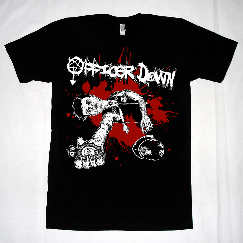
The Officer Down Shirts Are Done


Printed, Done, Dusted. Not much more to say. I think this is the first time I've ever had anything printed on a t-shirt. Enjoyable. Hopefully more to come, should be picking up the new album cover & booklet work in the new year.

Thursday, 2 December 2010

Officer Down Returns

So there was just a few more edits to do after sending the full piece off last time. Here's the final situation. The city scape has been cut completely and were down to the basics. Dead cop + blood. Fair enough. T-shirts coming soon.

Sunday, 28 November 2010

Officer Down T-Shirt Edit

So sent the first version off. I knew it was a little bit dodgy and I shouldn't of sent it to be honest but I was trying to knock it out in one session. Some sections were inversed while others weren't and it was a bit scratchy still. So the issue came back about the scratchiness but I though I'd sort out the inversed colour parts as well because the eyes just looked wrong. So I used illustrator, layered the original image underneath the last one and then removed sections to get the right parts showing through, then added some more block colour in. For ecample the jacket is now solid rather than crosshatched most noticably. And the hair is now blocked with white details as well. I think this looks a whole lot better than the last version, and also makes more sense.

Thursday, 25 November 2010

November 25th 2010: Officer Down T-Shirt Commision

Got a commision for a T-shirt design for a punk band from Bristol called Officer Down. Who I have been familiar with for a while. Check them out. http://www.reverbnation.com/officerdown or www.myspace.com/officerdownuk . Good straight up punk rock. They wanted something reflecting the name, including a cop, in a two colour on black. Heres what I came up with.


Drawing Number One: Officer Down with badge held out. Made sure it was an English style badge and uniform.


Drawing Number Two: City Scape & Helmet for additional imagery to be added to the main section.


Final Design: Reversed out the imagery, added the band logo and some good, old-fashioned, blood splatter. Fini. Overall I'm pretty happy with that. On the screen it looks a little weird because of the detail being condensed, but when it's blown up to the actual size it would be printed out it looks good. I like the addition of the blood to the 'W' on the logo, helps to bring the whole piece together.

Sunday, 7 November 2010

Dogs For The Disabled: Shoot Dead


List item number four: Shoot Dead.
A trick in which you make a gun hand shape... thing and say bang and the dog plays dead.
I'm getting much, much faster at these. This took about half the time of the others although I had a lot of trouble with the shape of the back legs. I really like the hand though, works well. This is also post number 400.

Saturday, 31 July 2010

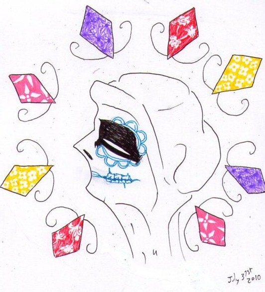
July 31st 2010: Stylised Gypsy Head

Stylising people is awesome. Love the eye on this. Gonna use that again.