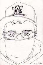
I don't know WHAT I was doing with the composition on yesterdays piece. I must of been knackered. As soon as I left it alone I realised how bad it was. Here's a new one. Threw in a little extra transparency and a rejiggle of elements. Also cleaned up a whole bunch of small overlap errors and areas where the strokes weren't quite right and stuff. Much better.
On a poster-print?


No comments:
Post a Comment