Showing posts with label Poster. Show all posts

Wednesday, 25 April 2012

EMP (and not EMP) Postcards

As a little addition to link my full size posters with the vinyl toys I decided to make postcards of  the full posters but also with photos of the vinyl toys and the type from the posters. I included the name of the character & the name of the actor that played them & once they're printed they will all be signed & for EMP purposes the cards showing the figures will be numbered as a sort of authentication certificate system. And since it's nearly show time I though it would be good to have some other bits to hand out so I've gone for some prints of my favourite old pieces as well.  

Back

Big Trouble In Little China


Troll Hunter


Small Town Folk


Others


Sunday, 22 April 2012

EMP Poster 2: Troll Hunter - Black

In the final crit for this project, year and indeed the entire of my BA degree course the only thing suggested as a change was to make the backing of the Trollhunter poster black in order to keep it consistent with the BTILC poster. I wasn't sure but after using a black backing for the STF poster as well I thought it would be good to have them all on black. I'd tried this before & didn't like it because it added itself to the border and looked like it was cutting into the image heavily, so I switched the border to white - problem solved.


EMP Poster 3: Small Town Folk


No messing around with this one. Get it done. Took my inspiration for various other horror movie posters where the killer is visable in centre frame but is obscured in some way, either by their back being turned or something hiding them to leave some suspense to finding out what they look like. I went for a simple fade out on three edges and the sickle coming forward on the right. I went for a simple colour palette this time. After creating two heavily coloured and heavily detailed posters I felt that I needed to try my hand at something a little more refined. White, grey, black, two shades of blue, red & a flare. I sat the figure on a black background to allow the fade. The typography again is the same in terms of the information text and the title typeface is Arno Pro (display) which is close to the typeface used in the original artwork. I chose to use only a single splash of red so that it really stands out from the rest of the image, it can be easy to use too much red which ruins the balance of a piece and I wanted to keep it minimal and suggestive rather than painting blood all over the place.


Wednesday, 18 April 2012

EMP Poster 2: Trollhunter - Finished

After hours of fiddling about with different coloured backgrounds, tag-lines, different coloured type, fonts, styles, slanting the type, throwing on textures and taking them off again I decided - no, I'm just going to leave it simple. So I did and I think it works well. I already talked about the illustration in an earlier post so I'll skip that. In terms of the text I wanted to keep it similar to the official typeface and Franchise is the closest I could find, it's very similar. It's all in lower case but looks like uppers. I also wanted to keep the yellow of the Trollhunter title as I think that is something that is really memorable from the original artwork. I found that having the whole title in plain yellow left it a little lost in the imagery, I tried it with a black stroke but that didn't help much so I reversed the two, black with a yellow stroke seems to work well. It doesn't get lost because of the boldness of the black but keeps the yellow that I wanted. I carried this across to the information section at the bottom to bring a little consistency and add more yellow. If you compare the layout of this type with that of my BTILC poster you'll notice that they are pretty much the same. This is to keep the series bound as a set. 

Overall I'm happy with the outcome of this piece, I think that it displays the mood of the film but in my own illustrative fashion and compliments the original artwork well. 


Monday, 16 April 2012

EMP Poster 1: Big Trouble In Little China - Finally Finished

This has been, without a doubt, the most extensive period of time spent on a single illustration I've ever done. According to my blog record I posted the first character for this on the 30/01/12, and that took a few days in itself. So I've been working on this for nearly 3 months and it is finally finished and I am SO glad. I've added in the Kim Cattrall character (You have to have a woman in the poster somewhere. It's a rule.) and I've dropped the guardian simply because of the logistics of fitting him into the frame. Because of his shape he was being really awkward and wasn't fitting properly with any of the other characters and was throwing out the whole balance of the image so in the end I had to cut him from the final piece. I went with a black background & blended that into the bottom of the characters. 

I also abandoned the hand-made text I had after some feedback regarding its inaccuracy and general shoddiness. I tried to keep the typeface as close to the original movie posters/cover as possible as I think it's a fairly iconic part of the imagery for this particular film. So I used the same colour gradient with the same stroke for the lettering. The typeface used for the title is Big Noodle Titling (which frankly sounds like it was made for this piece anyway) which was close enough to the original to be similar but not so 80's as to look as tacky. The typefaces used for the information at the bottom are OSP - DIN ( my favourite that I use on everything ) and I wanted another sans-serif to compliment it and after trying a bunch ended up with Trebuchet. ( I think that's how it's spelt. ) I like the effect that using different weights and sizes of the same font within a line has; I think it really helps to emphasise certain words without being too distracting or breaking the flow. These two typefaces and positioning of the information will be constant across all my posters to create a sense of them being a set.

Overall I'm really happy with the final outcome of this poster. I think that the illustrations have all joined together well to create a strong, balanced image that holds its own but is supported by the typography. I wanted to do justice to the original imagery used and I think that by taking elements of the compositional style and typography that I have managed to do so whilst bringing in my own take on the characters. 

Enough talking.
Here's a picture.


I can't wait until this is blown up to A1.
I also made a tiny body-bag as packaging for my Small Town Folk vinyl today. But it's not quite finished so I'll hold off on the imagery for now.

Friday, 13 April 2012

EMP Poster 2: Troll Hunter - Illustration

This took about 4/5 days to draw and 2 solid days on Photoshop to paint.
I went with Photoshop instead of illustrator, and a more stylised illustration because I'm trying to work with different styles/techniques across the range of posters to demonstrate my various abilities. Outline first, scan, select range, drop the backing out & then paint underneath the outline. Start with a base colour, usually a mid, then go a shade darker, then again & continue to build them up until you get the desired tones in the right areas. Throw in some extra colours, drop some opacities to get the tones/shades coming through. Many brushes. 

The inspiration for this piece (aside from the epic scene in Troll Hunter where he battles the Jotnar) was old movie posters for monster movies. Films like King Kong, Godzilla etc, where the monster towers over everything. 


Fee Fi Fo Fum

Wednesday, 11 April 2012

EMP Poster 1: Big Trouble In Little China - The Third Storm

The third storm.
They all wear the same hats. Just one more vector character to do. Then possibly background. And typography. And composition.

I finished my A1 Troll Hunter illustration today. That's likely to be up tomorrow. 


Thursday, 22 March 2012

EMP Poster 1: Big Trouble In Little China - The Guardian

Sees All, Knows All. 
The Guardian.
 
Squishy ball man with an eyeball in his mouth and tubes and things. Looking at this now the eye in the mouth needs sorting out but it's being fiddly and I can't make it work.

Wednesday, 21 March 2012

EMP Poster 1: Big Trouble In Little China - Wicker Hat Man #2


The second Storm from Big Trouble In Little China. It's all about enormous wicker hats.
I'm not as happy with this one as with the other characters, I may go back and re-work a lot of the detail and colouring. Just seems to be lacking something, maybe I forgot something. Don't know. I used the same colours for the face as the last Storm to keep it consistent. Next up I've got the third Storm to illustrate, then the guardian. Also I'm going to start work on my Troll Hunter poster and I'm halfway through painting my vinyl figure of James Hong. Photos to follow.

Tuesday, 21 February 2012

EMP Poster 1: Big Trouble In Little China - Exploding-Fat-Head-Guy

You've never seen anyone with a head this fat.

For those unfamiliar with the movie, there is a scene where a guy swells up and then his head explodes.
For the final poster some streams of smoke coming out of his nostrils will be added.

Thursday, 16 February 2012

Monday, 30 January 2012

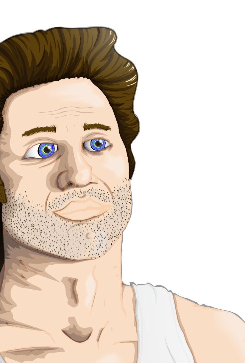
EMP Poster 1: Big Trouble In Little China - James Hong

EMP (extended major project) has begun.
I am producing a series of highly detailed, illustration movie posters for some weird and wonderful movies.
The first I picked was 'Big Trouble In Little China'.
Here's part 1 - James Hong.

Close up.

Full.


Gradient, blend & a lot of time on illustrator.
Next: Kurt Russell.

Monday, 5 December 2011

New Print - Lost Soul A2 Poster Print now available online.

Just in time for Christmas, why not get yourself/someone else a sweet print?


Lost Soul A2 print on silk finish paper. It's tight.
£12.50


Monday, 10 October 2011

Year 3 - Project 1: VisCom Poster - Diamond

Diamond for poster design.
Draw.


Then Vectorise.

Year 3 - Project 1: VisCom Poster - Work In Progress

Back to uni for my 3rd year of Visual Communication.
The first project out of the bag is to create an A3 poster which promotes VisCom to prospective students whilst delivering both my own take on the course and also presenting my specialism. Obviously illustration is my specialism so the only thing left to do was come up with my take on the course. After some thinking I came up with "Difficult But Ultimately Rewarding." To me that pretty much sums it up. Here's what I'm working on.

Musk Oxen. Ox's are stubborn and therefore represent difficulty.


Vector Musk Oxen.


With a side order of diamonds to represent the reward.


More to follow.

Monday, 5 September 2011

Tuesday, 30 August 2011

Dead Girls Don't Cry Poster

I don't know WHAT I was doing with the composition on yesterdays piece. I must of been knackered. As soon as I left it alone I realised how bad it was. Here's a new one. Threw in a little extra transparency and a rejiggle of elements. Also cleaned up a whole bunch of small overlap errors and areas where the strokes weren't quite right and stuff. Much better.


On a poster-print?


Thursday, 7 April 2011

Professional Project: Illustration Number Nine - Roman Army (Revisited)


I didn't like the last version. It was far too simple, I didn't spend enough time on it, just tried to get it done so I went back to it and spent more time and thought about it more. Incorporated a banner, the crossed swords & wreath, the S.P.Q.R of the Roman army, changed the 'Disobey' to simply 'Obey', added a little motto to the bottom and generally worked off of the Obey poster style and colour palette. This is a hundred times better. Aesthetically it is much more pleasing for a start, it also holds a lot more information than the previous version. It's been a good morning.