Showing posts with label InDesign. Show all posts

Wednesday, 23 May 2012

I Would Feel Less Alone - Typography

I got bored.
I don't know why I keep using these lyrics.
I just really like them.


Monday, 14 May 2012

Sunday, 22 April 2012

EMP Poster 3: Small Town Folk


No messing around with this one. Get it done. Took my inspiration for various other horror movie posters where the killer is visable in centre frame but is obscured in some way, either by their back being turned or something hiding them to leave some suspense to finding out what they look like. I went for a simple fade out on three edges and the sickle coming forward on the right. I went for a simple colour palette this time. After creating two heavily coloured and heavily detailed posters I felt that I needed to try my hand at something a little more refined. White, grey, black, two shades of blue, red & a flare. I sat the figure on a black background to allow the fade. The typography again is the same in terms of the information text and the title typeface is Arno Pro (display) which is close to the typeface used in the original artwork. I chose to use only a single splash of red so that it really stands out from the rest of the image, it can be easy to use too much red which ruins the balance of a piece and I wanted to keep it minimal and suggestive rather than painting blood all over the place.


Wednesday, 26 October 2011

Year 3 - Project 2: The Future Of Illustration - Illustration: The Next Ten years | Twenty Twenty Two

Report for the future of illustration project.
I felt like doing something type based. I kept it really plain and simple. Hopefully in an elegant way.
Front cover. Font is OPS DIN.


Pages 1&2. Outlining the early steps of the project.
It looks a little odd when it's spread out like this on a flat design because you don't get the fold and the two sides sort of merge together. It looks better in the real book. I'll get some photos up.


Pages 3&4 in which we find the script for the voice-over.


Pages 5&6. Outlining the later stages of the project.
Throughout the book I used different point sizes to emphasise some words and different tracking and spacing to make the layout and type seem a little erratic and free-formed in the same way that the illustration was. I think the coloured bars hold it together well.


The back cover is plain so I'm not posting it.
Here instead is the jacket for the booklet.

Thursday, 5 May 2011

Professional Project Book Photos

 The book has been printed. Here it is, I haven't photographed every page. If you want to see it all you'll have to buy one. Very happy with the quality of the print. Final Spec: 180gsm Premium matte paper, Hardback, perfect bound, image wrap, full colour, charcoal grey end papers. 

Front Cover


End Paper


Title Page


Intro & Process


Subject Introduction 


Blue Skies & Adventure


Threats & Eagles


Back Cover

If anybody wants a copy you can get it direct from the printers (so no extra charge added) here:
http://www.blurb.com/bookstore/detail/2132461

Thursday, 14 April 2011

Professional Project: Layouts And So Forth

New Front Cover featuring the photography hand C.

End Page 1 & Title Page


Intro Pages

 Intro to new Subject Matter for Illustration


Tuesday, 5 April 2011

Professional Project: Front Cover Mock Up

One of the ideas that arose at the last crit was a front cover idea. Basically since I've used so many styles & techniques of illustration in the project, to reflect this in the cover design by illustrating my name using various methods/styles of typography. Sounded good. Here's my letters.


Here's the end result that took far too long. This would be printed onto brown paper/card/backing so it wouldn't seem quite as plain as it does here. I think I worked this one out quite well considering types not really my fortay. Got a mix of hand rendered and digital characters, bold and weaker, positive and negative, pencil and pen, simple and ellaborate. I might play around with it a bit more as at the moment the central 'E' is a little bit lost in between all the bolder letters, could sort this out by dropping some of the blacks to greys to give the type as a whole some more mid-tones. I'm also playing around with some photo work which I might substitute in at a later point for one of the letters. But for now, this is what I've got.

Thursday, 3 February 2011

Professional Project Update

Earlier today we had the pitch/initial critique for our Final Major Projects. Mine did not go well to say the least. Below is what I presented. 


It's essentially an idea for an art/illustration book containing my artwork similar to that of many that can be found in bookshops/art shops/libraries. I got shot down because it was generally felt that the idea lacked a little substance/context. It needed a reason or a theme that could run throughout the book and make it more interesting rather than just a compilation of my work. There were many suggestions for this but one quickly rose to the top which was to base it around my 365 drawings from last year. After some thinking I decided that I don't want to just document these in a book though as that means my entire project is InDesign based. So what I'm going to do is use the process idea from my 2010 work, in which I would find something to illustrate and respond to it within a certain time period. I want to look more into the methods of finding the subject matter and the process that goes into it. I will be trying out various methods from scrolling through links on wikipedia to simply asking people on facebook to looking at trends on twitter.
It's all about the process.

Thursday, 18 November 2010

Graphic Systems Finalisation

Presentation Board layout for my book covers. Seeing them like this, all together for the first time, makes me like them more as you can clearly see how consistent the system is through, especially with the addition of the spine set to the end of the line. All in all I am thoroughly pleased with the work on this project, and even more pleased that I actually enjoyed working on it. Overall I think that the set works really well as a whole unit, each one is obviously slightly different to the last as they are all hand made but the titles fall in the same place and the layout of the pages underneath are all similar. And the back pages are all pretty much exactly the same, save for a few different nudges in layout, but they all manage to retain individuality through the hand made feel & the colour scheme. The illustration I feel are strong, some more than others, such as the pigs head is perhaps a little weak, but as a set of illustrations I think they work brilliantly to capture the feel of the books & the style of the author and compliment both each other, and the colour scheme really well. I'm also pleased with the calligraphy type. Each one is really individual due to leaks & splatter in different places and the shapes of letters but due to style and positioning they look quite uniform with each other.

Graphic Systems mock ups

Part of the hand in criteria is to produce at least two fully mocked up books complete with your covers. So here they are, shot very professionally...in my kitchen... I went for my two favourite covers of the set, Walk in the woods & Down under.

Backs of both books.

Backs & Spines 


Backs & paper sides. For the paper sides I just used a flat tab that I drew vertical lines down, I think it works pretty well as an illusion.

Front covers

Front & paper sides, illusion in full working mode.

Fronts & spines.
Overall I'm really pleased with how well these have turned out, they look like real book covers & are effective both individually and together which is pretty much what I was aiming for so that's good.

Business Identity Finalisation

Presenation board layout for business identity project. Got the business card there on the left, then the compliment slip in the centre, and the letter head on the right. Over all I think that's looking pretty good. I had a bit of trouble with the awkward shape of the necklace but I think it's working now.

Wednesday, 17 November 2010

Graphic Systems: Neither her nor there Compeleted


The book cover for the sixth and final book in the series, Neither here nor there. I like the pink on the blue, it's working really well I feel, and overall looking back through the colour schemes of all 6 they fit together well as a series. The smaller illustration here is of a piece of swiss cheese, as mentioned in the book & the main illustration is of a pigs head with an apple in it's mouth, also mentioned in the book. This illustration is a little darker than the others in terms of content but they vary from book to book so I don't think this is too much of a drastic problem. I like the layout on the front a lot, again it is differnet from the others but the themes stay consistent throughout. As a whole series i'm really pleased with the work, the colour schemes, layouts, illustration & type are all working well together as a system.

Monday, 15 November 2010

Graphic Systems: Down under completed


The fifth book cover is complete. This one is for Down under, a book about Australia which is why I've gone with this colour scheme. I have already used yellow, which would of been first choice, so I had to go with this light brown which is as close as I could get and think it works well to reflect the country. It also works well with the green on top and the bright orange really stands out. The small illustration is of a boomarang for obvious reasons. The large illustration is of a Nothomyrmecia Macrops which I find really interesting. It is a species of ant that was thought to have died out 100 million years ago but has been found living in colonies in the Australian outback. It is a species left from when wasps were evolving into ants (which in itself I find fascinating, although the shape of them is a give away if you think about it). On the back cover I've gone with the same kind of format that I used on the first book, with an illustration down one side and then the quotes on the other. In this case I think that this has worked particularly well and has created an effective layout. Overall I'm really pleased with this one, I think that the layout, illustration & colour scheme & I think they are all working really well together to give a representation of Australia and the trip.

Sunday, 14 November 2010

Graphic Systems: The lost continent Completed


Continuing my speedy work on this project I give you; The lost continent. Here, obviously, we have again a similar layout to the ones designed previously. Today's illustration is of a portable gas stove (as mentioned in the book), I did a little bit of research into it and this is the sort of style that was around in the time that Bryson is taking about. I like the knobs on it, I think they work really well with the white set against the coloured backing. Continued is the type as well. The additional illustration above the authors name is of a corn cob, a reference to small town America & also mentioned in the opening of the book. The colour scheme is staying basic, one main colour, white, and smaller pieces of additional colour. The box on the back on two of the covers has a black circle around on the inside, the other two don't. This is because two of the covers have a lot more written on the back, I'm going to split it three to three to keep it even. The layout on the fronts also been changed around again but this is acceptable as the system allows the movement as long as it's fairly similar.

Friday, 12 November 2010

Graphic Systems: A walk in the woods Completed


Another book cover busted out in a day, even though I had a crit all day at uni. Speed. It's getting easier now that I've figured out my system for setting up the files & getting things in the right place. I really like the colour scheme on this one, I think the green and the brown are working really well together and the yellow of the bears face really stands out as it's the only other colour. This ones got a leaf as the extra little illustration above 'Bryson' which is obviously derived from 'the woods.' In addition to this I've also added a couple of little twigs onto the back cover box as it was brown which made me think "tree." Overall I think this is another successful cover. It's slightly different to the others; as it had such a vertical illustration I had to move the bear to one side and have the text on the other but I don't think that this has effected the layout negatively at all. It just adds a little more variety to the set. The crit went well today, my designs recieved a good reception and the only problem that came up were the use of the grid to get sections like the 'Black Swan' logo & the barcode in the same place every time. So I edited my grid system and simply dropped the barcode and repeating text at the bottom of the back cover onto the master page. Problems solved.

Thursday, 11 November 2010

Graphic Systems: Notes from a small island Completed


After faffing around with the style of illustration for so long and taking forever over the first cover it was time to pull my finger out. So I bashed this one out in a little under... lets say 8 hours. A days work (although I won't be stopping yet). I've added in the blurb here, my own abridged version in fact since the one on the back of the book was near enough a full page. I've also got the swan up in there and I even did all the nerdy stuff like making sure the sections of the spine line up with the ones on the other cover. Next!

Graphic Systems: Notes from a small island


Second book cover. Same illustration style as before with the cut out paper. I'm really pleased with how the boxer shorts turned out and I've picked the colour palette to reflect the UK. However after talking to Neil I think I may need to rethink the colours slightly so as to keep it more consistent with the brightness of the first cover. Other than that I think the layouts are working well. Obviously this still needs a couple of pieces adding such as the Black Swan logo, the blurb and the quotes on the back.


I tried making the backing brighter so that it matches the first cover a bit more but I think it just looks a bit washed out and makes the illustrations look a little lost whereas the textured quality of the first one helps to hold it all together so I think I'm going to stick with that one.

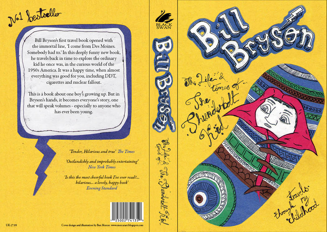
Graphic Systems: The Thunderbolt Kid Complete


Here's the remade baby mounted on yellow as it will be on the book cover. 


I made this for the back of the book to keep the theme consistent.


Here's the final cover design. Overall I'm quite pleased with how this one's turned out. I think the illustrations and the type compliment each other and the colour scheme is working well. I like the layout on both sides and the spine. I spent ages going through typefaces for the blurb and eventually pick Garamond premier pro. I think it's more formal than the illustrations which is good, but isn't too old as to the throw out the balance of the piece. I've used the same font for the quotes underneath but in italic, with the writer of the quote in the same blue as the colour scheme.

Wednesday, 27 October 2010

Business Identity Letterhead

After messing about with a lot of different layouts I came up with this one. Overall I think this works fairly well, I've managed to keep the type at the top in a small way but I found that using it for all the text was a little overpowering & distracting from the layout. I've also re-used the wolf here which would be a watermark, ideally this would be printed onto some rough/handmade paper to keep the natural feel throughout. The decorations on the page are Native American patterns which I felt would both be appropriate and add another dimension to the piece. I wanted to keep the second name & the meaning in as well so I've used that as the name on the address. I couldn't find an actual address for Matilda Joselyn Gage so I've created one from elements such as her birth year, husbands last name & city of birth. As a whole I think this is quite effective, it keeps in all the elements that I want to reflect about the subject & is also looks good.

Monday, 18 October 2010

Delayed Summer Project

So were back to the summer project that went AWOL. Today has been spent fussing with re-creations, paragraph styles, tech problems & generally getting back to grips with InDesign. After four trips back and forth from the printers we finally managed to get the files all correct and it's been set up to print. Photos to follow of the actual book, but for now heres some JPGs.


Front and back covers.
We wanted to keep this simple and effective and not overcrowd it. I think this has worked quite well by using the corners rather than setting up a standard title situation. I think it makes it quite interesting and unusual. The page size is 200mm by 200mm as it is a standard size which we could all work to & get printed cheaply. The grid we used was a 3 column grid, 12.7mm margins & 5mm gutters.


Inside front cover & page 1.
Again very simple leading into the book which I think is effective for the same reasons. I like the unusual layout. We used 'Eurostyles' 10pt for the body copy & 'Rockwell extra bold' for the title. The brief was to take elements of all four of our original layouts & combine them to create a consistent book. Body copy was chosen from Vicky Kwan's & the title font is from my work. We felt these worked well both individually and as a combination as both are easily legible but are different enough that they don't merge.


Page 2 & 3.
Re-creation of my original layout. The font has been changed to 'Eurostyles' to fit with the rest of the book, this meant I needed to make a few tweaks in order to realign the copy & stop any widows etc.
My layout was also the only one of the 4 to have running heads at the top so these have now been moved to the bottom.


Page 4 & 5.
Due to the slight change in page size & grid the image had to be changed in size in order to keep the composition correct. We chose to keep coloured questions throughout as all white looked a little plain. The questions are also in bold as 3 of 4 previous designs already has this element.


Page 6 & 7.
First set of Vicky's spreads. This was more of an issue as 3 of us had black backgrounds while Vicky's had full illustrations. We tried a few different things but in the end we elected to keep the imagery the same & make it contrast with the rest of the work. She also had a 1,2,1 set up of a 4 page spread rather than a two double page set up which meant a rearranging of her imagery in order to make it fit.


Page 8 & 9.
As we all used different colours in our imagery we felt it bet to each use different colours in our text as well that would complement the imagery so Vicky stuck with red.


Page 10 & 11.
Quite similar to mine in the colour scheme, the only difference is there is no space between the questions & the answers due to space issues it had to be compressed in order to fit the whole interview into the space provided & keep the composition interesting.


Page 12 & 13.
On some pages we have removed the running heads as it would of ruined the composition of the page.


Page 14 & 15.
Another black background layout, the main difference here is the use of colour which is blue instead of yellow so as to be consistent with the imagery.


Page 16 & 17.


Page 18 & 19.
Back to simplicity to fit in with the front cover & contents page. After our trips to the printers we had to add two more pages so as to create the required 4 pages for a signature. These are not shown here because they are blank.