So I finally got round to sorting out the design gallery. This presented a few problems in the form of missing loads of formating on pictures and then having to go back and change loads of CMYK to RGB and stuff like that. But I got it done in the end and there it is. I also added a few more photos and illustrations to their appropriate gallerys since I found a couple of extra bits, double checked my code, live viewed everything and as far as I can see it's all ready to go live. So tommorow I will upload. And then we shall see the results.
Showing posts with label bill bryson. Show all posts
Sunday, 9 January 2011
Design Gallery and Finishing Touches
Labels:
Ants,
Ben Mercer,
bill bryson,
book covers,
Design,
down under,
dreamweaver,
gallery,
Me,
SBC2,
Uni,
website
Thursday, 18 November 2010
Graphic Systems Finalisation
Presentation Board layout for my book covers. Seeing them like this, all together for the first time, makes me like them more as you can clearly see how consistent the system is through, especially with the addition of the spine set to the end of the line. All in all I am thoroughly pleased with the work on this project, and even more pleased that I actually enjoyed working on it. Overall I think that the set works really well as a whole unit, each one is obviously slightly different to the last as they are all hand made but the titles fall in the same place and the layout of the pages underneath are all similar. And the back pages are all pretty much exactly the same, save for a few different nudges in layout, but they all manage to retain individuality through the hand made feel & the colour scheme. The illustration I feel are strong, some more than others, such as the pigs head is perhaps a little weak, but as a set of illustrations I think they work brilliantly to capture the feel of the books & the style of the author and compliment both each other, and the colour scheme really well. I'm also pleased with the calligraphy type. Each one is really individual due to leaks & splatter in different places and the shapes of letters but due to style and positioning they look quite uniform with each other.
Graphic Systems mock ups
Part of the hand in criteria is to produce at least two fully mocked up books complete with your covers. So here they are, shot very professionally...in my kitchen... I went for my two favourite covers of the set, Walk in the woods & Down under.
Backs of both books.
Backs & Spines
Backs & paper sides. For the paper sides I just used a flat tab that I drew vertical lines down, I think it works pretty well as an illusion.
Front covers
Front & paper sides, illusion in full working mode.
Fronts & spines.
Overall I'm really pleased with how well these have turned out, they look like real book covers & are effective both individually and together which is pretty much what I was aiming for so that's good.
Labels:
a walk in the woods,
Ben Mercer,
bill bryson,
book,
book covers,
Books,
down under,
Drawing,
Graphic Systems,
Illustration,
InDesign,
Photos,
photoshop,
Uni
Wednesday, 17 November 2010
Graphic Systems: Spineset
My spine set, as it would appear if all six books were lined up next to each other. (The yellow book has been edited since the version shown was created and now the black swan is the same as the others) I think this works really well, the colours are good, and I think they work particularly well as each backing colour appears again as the outline around the authors name, except for the white, but thats used in the name anyway. I also like how the titles have worked out, each one individual with its own splatter patterns but set in the same place. This really looks like an actual set which is obviously what it's meant to do so i'm happy with it.
Graphic Systems: Neither her nor there Compeleted
The book cover for the sixth and final book in the series, Neither here nor there. I like the pink on the blue, it's working really well I feel, and overall looking back through the colour schemes of all 6 they fit together well as a series. The smaller illustration here is of a piece of swiss cheese, as mentioned in the book & the main illustration is of a pigs head with an apple in it's mouth, also mentioned in the book. This illustration is a little darker than the others in terms of content but they vary from book to book so I don't think this is too much of a drastic problem. I like the layout on the front a lot, again it is differnet from the others but the themes stay consistent throughout. As a whole series i'm really pleased with the work, the colour schemes, layouts, illustration & type are all working well together as a system.
Labels:
apple,
Ben Mercer,
bill bryson,
book,
book covers,
Books,
Drawing,
europe,
Graphic Systems,
head,
Illustration,
InDesign,
Layouts,
neither here nor there,
photoshop,
pig,
Uni
Monday, 15 November 2010
Graphic Systems: Down under completed
The fifth book cover is complete. This one is for Down under, a book about Australia which is why I've gone with this colour scheme. I have already used yellow, which would of been first choice, so I had to go with this light brown which is as close as I could get and think it works well to reflect the country. It also works well with the green on top and the bright orange really stands out. The small illustration is of a boomarang for obvious reasons. The large illustration is of a Nothomyrmecia Macrops which I find really interesting. It is a species of ant that was thought to have died out 100 million years ago but has been found living in colonies in the Australian outback. It is a species left from when wasps were evolving into ants (which in itself I find fascinating, although the shape of them is a give away if you think about it). On the back cover I've gone with the same kind of format that I used on the first book, with an illustration down one side and then the quotes on the other. In this case I think that this has worked particularly well and has created an effective layout. Overall I'm really pleased with this one, I think that the layout, illustration & colour scheme & I think they are all working really well together to give a representation of Australia and the trip.
Labels:
Ants,
australia,
Ben Mercer,
bill bryson,
book covers,
Books,
down under,
Drawing,
Graphic Systems,
Illustration,
InDesign,
Layouts,
leaf,
macrops,
nothomyrmecia,
outback,
photoshop,
travels,
Uni
Sunday, 14 November 2010
Graphic Systems: The lost continent Completed
Continuing my speedy work on this project I give you; The lost continent. Here, obviously, we have again a similar layout to the ones designed previously. Today's illustration is of a portable gas stove (as mentioned in the book), I did a little bit of research into it and this is the sort of style that was around in the time that Bryson is taking about. I like the knobs on it, I think they work really well with the white set against the coloured backing. Continued is the type as well. The additional illustration above the authors name is of a corn cob, a reference to small town America & also mentioned in the opening of the book. The colour scheme is staying basic, one main colour, white, and smaller pieces of additional colour. The box on the back on two of the covers has a black circle around on the inside, the other two don't. This is because two of the covers have a lot more written on the back, I'm going to split it three to three to keep it even. The layout on the fronts also been changed around again but this is acceptable as the system allows the movement as long as it's fairly similar.
Labels:
america,
Ben Mercer,
bill bryson,
book,
book covers,
Books,
continent,
Design,
Graphic Systems,
InDesign,
Layouts,
Lost,
photoshop,
small,
town,
Uni
Friday, 12 November 2010
Graphic Systems: A walk in the woods Completed
Another book cover busted out in a day, even though I had a crit all day at uni. Speed. It's getting easier now that I've figured out my system for setting up the files & getting things in the right place. I really like the colour scheme on this one, I think the green and the brown are working really well together and the yellow of the bears face really stands out as it's the only other colour. This ones got a leaf as the extra little illustration above 'Bryson' which is obviously derived from 'the woods.' In addition to this I've also added a couple of little twigs onto the back cover box as it was brown which made me think "tree." Overall I think this is another successful cover. It's slightly different to the others; as it had such a vertical illustration I had to move the bear to one side and have the text on the other but I don't think that this has effected the layout negatively at all. It just adds a little more variety to the set. The crit went well today, my designs recieved a good reception and the only problem that came up were the use of the grid to get sections like the 'Black Swan' logo & the barcode in the same place every time. So I edited my grid system and simply dropped the barcode and repeating text at the bottom of the back cover onto the master page. Problems solved.
Labels:
a walk in the woods,
bear,
Ben Mercer,
bill bryson,
book covers,
Books,
Design,
Drawing,
Graphic Systems,
Illustration,
InDesign,
Ink,
Layouts,
leaf,
photoshop,
Typography,
Uni
Thursday, 11 November 2010
Graphic Systems: A walk in the woods illustrated
So I'd had a super productive day anyway getting a whole cover done and thought I'd crack on and try and do as much of another one as I could. I read the first chapter and a half and discovered that about 80% of it is about bear attacks. So obviously I chose to illustrate a bear... it turns out I can't draw bears. I spent an hour and a half sketching really awful bear faces and then rubbing them out. So this one took forever to do even though it's so, so simple. But I'm quite pleased with the end result, it's consistent with the others but works on it's own as an illustration as well.
Labels:
a walk in the woods,
bear,
bears,
Ben Mercer,
bill bryson,
book covers,
Books,
Drawing,
Graphic Systems,
Illustration,
Uni
Graphic Systems: Notes from a small island Completed
After faffing around with the style of illustration for so long and taking forever over the first cover it was time to pull my finger out. So I bashed this one out in a little under... lets say 8 hours. A days work (although I won't be stopping yet). I've added in the blurb here, my own abridged version in fact since the one on the back of the book was near enough a full page. I've also got the swan up in there and I even did all the nerdy stuff like making sure the sections of the spine line up with the ones on the other cover. Next!
Labels:
Ben Mercer,
bill bryson,
book covers,
Books,
Design,
Drawing,
Graphic Systems,
Illustration,
Illustrator,
InDesign,
island,
notes from a,
photoshop,
small,
Typography,
Uni
Graphic Systems: Notes from a small island
Second book cover. Same illustration style as before with the cut out paper. I'm really pleased with how the boxer shorts turned out and I've picked the colour palette to reflect the UK. However after talking to Neil I think I may need to rethink the colours slightly so as to keep it more consistent with the brightness of the first cover. Other than that I think the layouts are working well. Obviously this still needs a couple of pieces adding such as the Black Swan logo, the blurb and the quotes on the back.
I tried making the backing brighter so that it matches the first cover a bit more but I think it just looks a bit washed out and makes the illustrations look a little lost whereas the textured quality of the first one helps to hold it all together so I think I'm going to stick with that one.
Labels:
Ben Mercer,
bill bryson,
book covers,
Books,
boxers,
Design,
Graphic Systems,
Illustration,
InDesign,
island,
notes from a,
photoshop,
shorts,
small,
Uni
Graphic Systems: The Thunderbolt Kid Complete
Here's the remade baby mounted on yellow as it will be on the book cover.
I made this for the back of the book to keep the theme consistent.
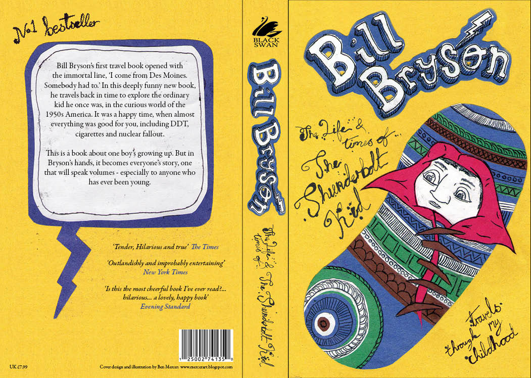
Here's the final cover design. Overall I'm quite pleased with how this one's turned out. I think the illustrations and the type compliment each other and the colour scheme is working well. I like the layout on both sides and the spine. I spent ages going through typefaces for the blurb and eventually pick Garamond premier pro. I think it's more formal than the illustrations which is good, but isn't too old as to the throw out the balance of the piece. I've used the same font for the quotes underneath but in italic, with the writer of the quote in the same blue as the colour scheme.
Subscribe to:
Posts (Atom)