My initial idea for the packaging for this was a Chinese dragon but as you can imagine, the logistics of making a decent looking dragon that works as a box... it didn't work. So I went with a lantern. This is taken from a tutorial I found here:
I adapted this to turn it into a box. To make this you will need:
48 Chinese Envelopes - you can get these on Ebay pretty cheap.
Cello tape.
Double-sided Tape.
Stapler & Staples,
3 Sides of Card - A4
1 Sides of Thick Paper/Card - A3
Chinese Charm Tassle Thing - another Ebay job.
String.
Scissors/Scalpel.
Ruler.
Letraset.
I made it exactly the same as the tutorial on the video, only cut about 1mm off the outside of 16 envelopes to create a slightly smaller octagon. I used this as the bottom half of the box. Instead of attaching the folded cards to the top of this I made a second middle section with the normal size cards. Measured up the necessary lengths, cut the same shape from card. Then the same shape again with the addition of 6cm of tab on each edge to create spacers, then a measured whole on the middle for the figure to sit in. That goes in the bottom. Tape string into the bottom & tie it together in the middle above the vinyl figure so that it hangs straight through the whole in the top. Sorted.
Knocked up a little DVD cover to wrap up my digital files in for when they're all burnt to disc. I took most of my inspiration for this from Quentin Tarantino/Grindhouse DVD covers and a little bit from retro video games.
As a little addition to link my full size posters with the vinyl toys I decided to make postcards of the full posters but also with photos of the vinyl toys and the type from the posters. I included the name of the character & the name of the actor that played them & once they're printed they will all be signed & for EMP purposes the cards showing the figures will be numbered as a sort of authentication certificate system. And since it's nearly show time I though it would be good to have some other bits to hand out so I've gone for some prints of my favourite old pieces as well.
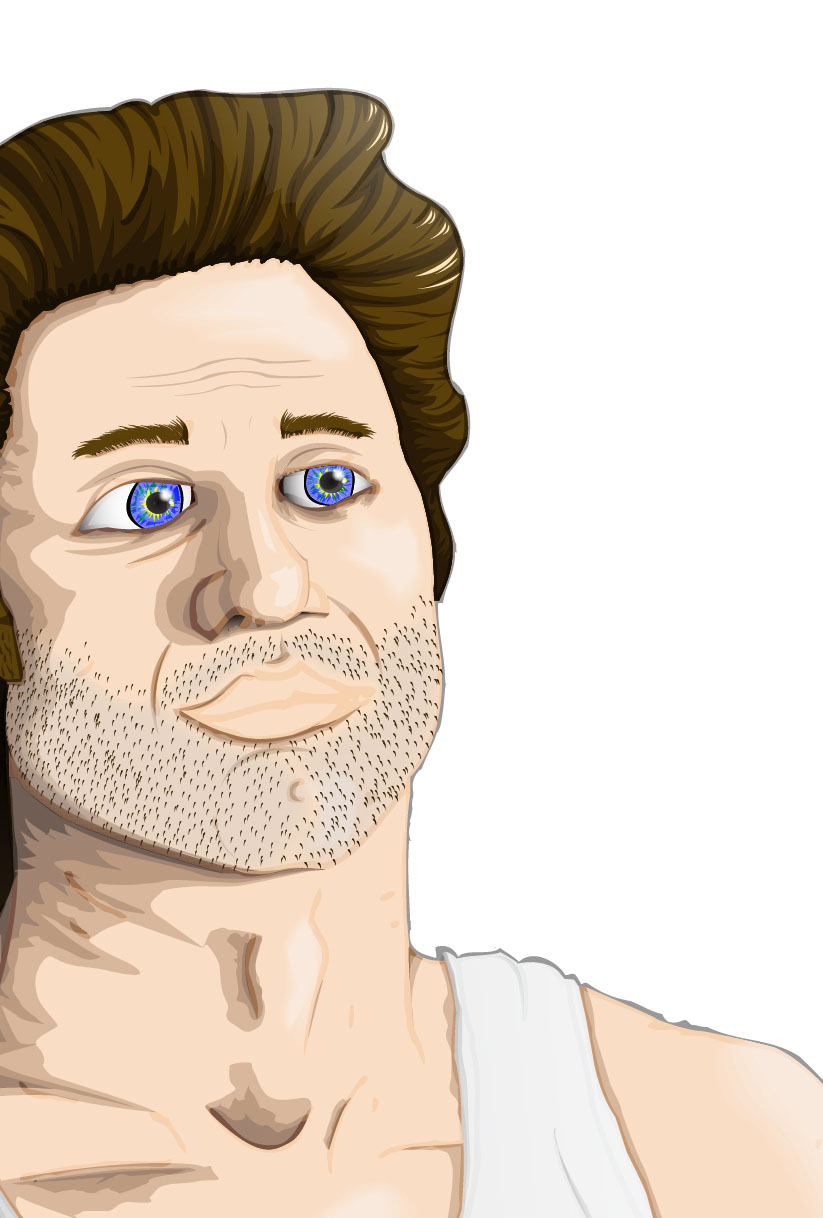
This has been, without a doubt, the most extensive period of time spent on a single illustration I've ever done. According to my blog record I posted the first character for this on the 30/01/12, and that took a few days in itself. So I've been working on this for nearly 3 months and it is finally finished and I am SO glad. I've added in the Kim Cattrall character (You have to have a woman in the poster somewhere. It's a rule.) and I've dropped the guardian simply because of the logistics of fitting him into the frame. Because of his shape he was being really awkward and wasn't fitting properly with any of the other characters and was throwing out the whole balance of the image so in the end I had to cut him from the final piece. I went with a black background & blended that into the bottom of the characters.
I also abandoned the hand-made text I had after some feedback regarding its inaccuracy and general shoddiness. I tried to keep the typeface as close to the original movie posters/cover as possible as I think it's a fairly iconic part of the imagery for this particular film. So I used the same colour gradient with the same stroke for the lettering. The typeface used for the title is Big Noodle Titling (which frankly sounds like it was made for this piece anyway) which was close enough to the original to be similar but not so 80's as to look as tacky. The typefaces used for the information at the bottom are OSP - DIN ( my favourite thatI use on everything ) and I wanted another sans-serif to compliment it and after trying a bunch ended up with Trebuchet. ( I think that's how it's spelt. ) I like the effect that using different weights and sizes of the same font within a line has; I think it really helps to emphasise certain words without being too distracting or breaking the flow. These two typefaces and positioning of the information will be constant across all my posters to create a sense of them being a set.
Overall I'm really happy with the final outcome of this poster. I think that the illustrations have all joined together well to create a strong, balanced image that holds its own but is supported by the typography. I wanted to do justice to the original imagery used and I think that by taking elements of the compositional style and typography that I have managed to do so whilst bringing in my own take on the characters.
Enough talking.
Here's a picture.
I can't wait until this is blown up to A1.
I also made a tiny body-bag as packaging for my Small Town Folk vinyl today. But it's not quite finished so I'll hold off on the imagery for now.
Squishy ball man with an eyeball in his mouth and tubes and things. Looking at this now the eye in the mouth needs sorting out but it's being fiddly and I can't make it work.
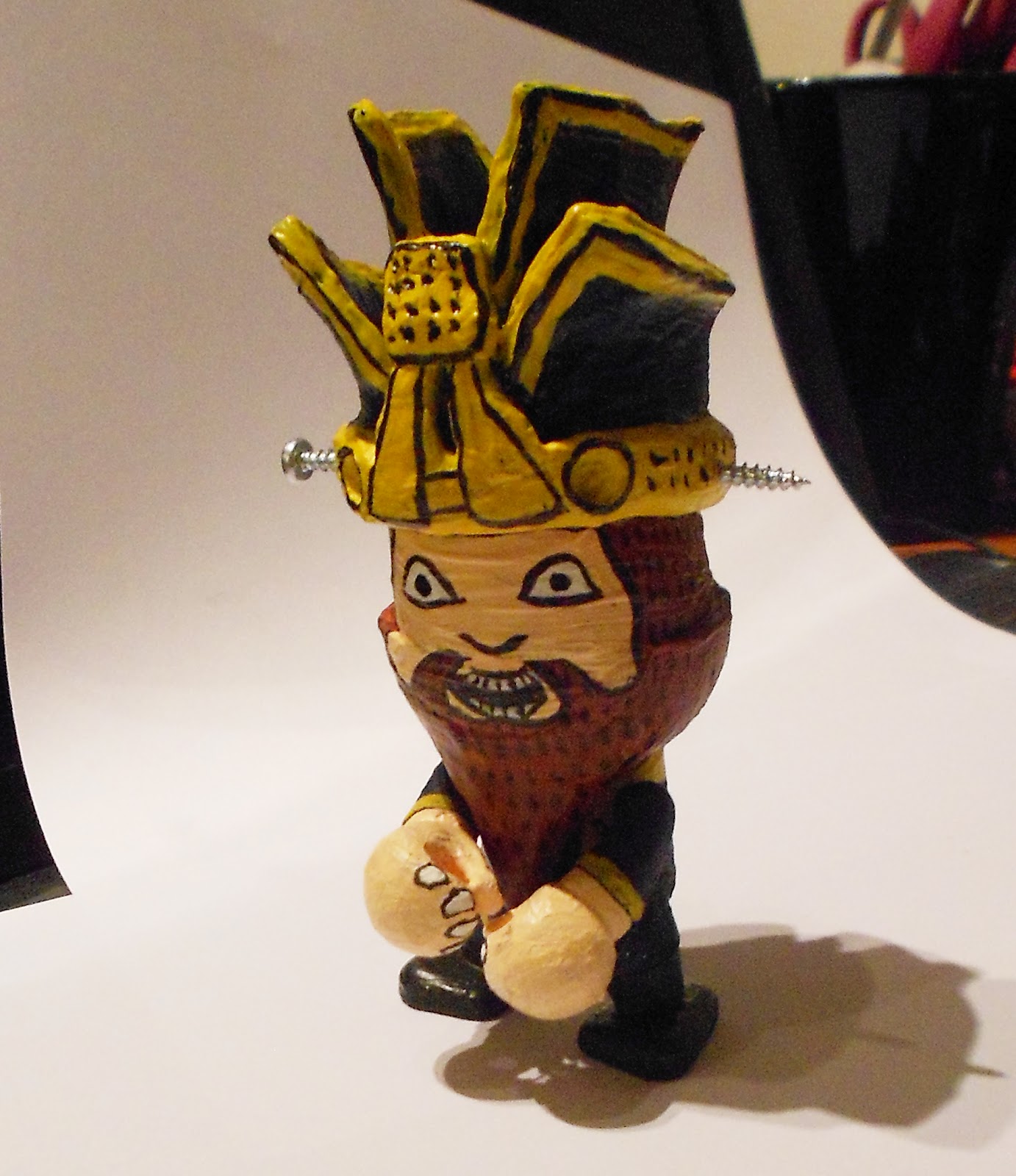
The subject is James Hong's character from Big Trouble In Little China. I used a 4inch Trexi model as a base and sculpey to add extra details. Also used a couple of screws as I felt that'd be preferably as a visual compared to trying to create a similar effect with the sculpey. Turns out this is actually really, really difficult & very time consuming but a lot of fun. Sculpting the right shapes without leaving marks is really awkward but it's a very versatile tool and holds a lot of strength in a thin sheet. I left the model in the oven for about 30 seconds too long and some sections of the vinyl started to melt which had to be rectified with a knife. Something to look out for if you make one yourself. Painting it was a delicate procedure which I completed in one colour at a time, luckily the model separates at various points which makes it considerably easier. Finished him up with some black ink details. One the paint is fully set (tomorrow) I shall be spray varnishing him for a nice shiny finish. I've already started my next one. Stay tuned.
The second Storm from Big Trouble In Little China. It's all about enormous wicker hats.
I'm not as happy with this one as with the other characters, I may go back and re-work a lot of the detail and colouring. Just seems to be lacking something, maybe I forgot something. Don't know. I used the same colours for the face as the last Storm to keep it consistent. Next up I've got the third Storm to illustrate, then the guardian. Also I'm going to start work on my Troll Hunter poster and I'm halfway through painting my vinyl figure of James Hong. Photos to follow.