Friday, 31 December 2010

December 31st 2010: Always Looking Doomed / The End Is Nigh

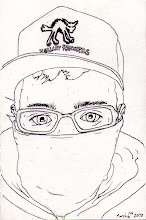
The End Is Nigh. I've done it before and I'll more than likely do it again, but I decided to finish off the year with a zombie self portrait. Above = photo, below = zombie.


Good facial expression captured, good eyes, good blood splatter. The end of the year. Wow. 365 drawings in as many days. Alongside all of my uni work and other stuff. It's been absolutely brutal on some days when I just could not find the inspiration/effort/ideas to be going on with. Whilst on other days it's been just awesome. I think 2011 is going to be interesting, I'm going to go for some larger pieces worked across a couple of weeks / a month rather than loads of little quick ones. I feel my skills have come on in leaps and bounds, certainly my knowledge and understanding of different techniques and styles has. I'm getting all nostalgic now. It was definitely a worthwhile challenge to set for myself. Bring on 2011.

Thursday, 30 December 2010

December 30th 2010: Tiger Boy


Continuing from yesterdays styles and theme of big cats. Doesn't work quite as well due to the fact that it's got a lot of white fur and so there's big spaces. But it still works well I think, a little more cutesy maybe but still good. Only one more to go.

Wednesday, 29 December 2010

December 29th 2010: The Lion's Share


Sometimes the lion's share ain't fair.
This looked like it wasn't going to work right the way up until I finished it. Luckily it all came together in the end otherwise it would have been a massive waste of two hours. Note to self: add a mid-grey outline to the edge of something, looks like a shadow. Nice.

Tuesday, 28 December 2010

December 28th 2010: Always Looking Bemused


Went for the dumb, stumbling zombie type today as opposed to yesterdays angry, intelligent one. This however means that the emotion in the face is a bit of a let down and as such I don't think it makes such a good image. The yellow eyes also make it a little bit cartoony.

Monday, 27 December 2010

December 27th 2010: Always Looking Dead


I think this is one of the best things I've done all year, and since it's the end of the year that logically means that I've been getting better throughout... right? Took the style i've been using recently and applied it to zombietime. Then applied colour. I love it. Way more realistic than most of my previous zombie draws but it's still stylised and the colour is all block but using the black line shading it changes it up a bit. Also no marker edges which I think has actually worked. Good times. I might get this framed.

Sunday, 26 December 2010

December 26th 2010: I Stumble But Never Fall


Christmas lazyness has occured a little over the lasy couple of days. Over-indulgence causes lapses in concentration. Further ideas for Stumble shirts, obviously would need to be redrawn since it's proper rushed & sketchy. I like the idea though, which was what it was mainly about. Also really like the sentence and the composition. So not bad for a lazy effort really.

Saturday, 25 December 2010

December 25th 2010: Munko Christmas


Merry Christmas everybody. For those of you not obsessed with David Choe like I am, this will need to be explained. Munko is the whale. The whale is a recurring character. I got a vinyl collectable of him for Christmas. I was busy.

Friday, 24 December 2010

December 24th 2010: Always Looking Manly


The first (and possibly only) man to enter the series. He looks a lot like Kevin Spacey for some reason. Coincidental. Nice shirt.

Thursday, 23 December 2010

The Officer Down Shirts Are Done


Printed, Done, Dusted. Not much more to say. I think this is the first time I've ever had anything printed on a t-shirt. Enjoyable. Hopefully more to come, should be picking up the new album cover & booklet work in the new year.

December 23rd 2010: Always Looking Catish

Cat.

Wednesday, 22 December 2010

December 22nd 2010: Always Looking Dismantled


Another Stumble piece based on Brody Dalle. Think it's working well, got the shading down, maybe a little too much across the stomach but I don't think it's effected it that much. The colour's a little more standard here. Red lips is pretty basic but I think it works for this picture. I like the Stumble aswell, different to the others and a lot more subtle but I like it. This looks better when it's bigger but i'm happy with it.

Tuesday, 21 December 2010

December 21st 2010: Always Looking Revenant


Based on a picture of Brody Dalle which is why I chose Revenant for the title. Pretty good. Think I nailed it other than messing up the shading in a couple of places but overall I think it's worked really well, I like big hoop earrings in drawings. I've started to work this style to my tastes now so I'm enjoying it more and more and I think getting better. Bit more colour in this which I think works really well, not so much as to be overpowering but the heart really pops out. As David Choe said, "Red is the king of colours."

Monday, 20 December 2010

December 20th 2010: Always Looking Anchored


Tight.
I think I've pretty much got this style down now. I love this one. I think the torso definitely makes it more interesting. Got the shading sorted. Tattoos look cool, adding an extra element, the hats bringing in some good qualities. Simple face with a bit of shading. The "Stumble" thing is becoming a theme. It's just an interesting word I like and I'm considering making a t-shirt company called Stumble so these would be some good designs. I think if it goes ahead this may well be the first desin I get printed. Purely because I want this on a t-shirt.

Sunday, 19 December 2010

December 19th 2010: Always Looking Wretched

Lazy spree didn't last long. Nailed this one I think. Possibly my favourite of the series so far, I like the use of the banner coming across there, brings it together nicely & makes it not just a plain portrait. Gives me the opportunity to get some type in there as well which is always good. Splash of colour, flowing hair, flower, good face with the right amount of shading. Tattoo on the neck works really well I think. Don't Cry For Me. I don't know why I picked "Wretched" for the title. Just seemed to fit while I was looking at it.

Saturday, 18 December 2010

December 18th 2010: Pandas Love Ball In The Cup


Pandas much prefer a ball in a cup to a yoyo. Yoyos are left in the dirt, unused. Sad and alone. While ball in a cup gets all the play time. This drawing is awful. Laziness sunk in. Snap out of it.

Friday, 17 December 2010

December 17th 2010: It's Watching Us...


Like father like son. Although the bigger one is clearly much better styled. More interesting face. Penguins are very self-consious.

Thursday, 16 December 2010

December 16th 2010: Always Looking Blue


Not so sure about this one. I like the little bit of blue in there, I think that works really well, as does having a little bit of a lighter grey as well. Gives it a couple of mid-tones which I think makes it a more rounded image (maybe) but I messed up the hat, and also I went a little bit mental on the shadow. Dial it back a bit and I think I've pretty much got it. We'll see next time. Finished another sketchbook. Gonna have to go out and get a new one tommorow to finish up my 2010 session. Also I really like the lips styles on these last two. When you get the white lines and the fill right then they look ace.

Wednesday, 15 December 2010

December 15th 2010: Always Looking Ahead


Another go on this style. Not as good as yesterday I don't think. Technically probably a little better, got my white lines in the right place and stuff, but I think this filling out tech works better with a hat/hood or something, and less neck going on. That way you've just got the face amongst a lot of block shading. Still like this one though. Start up a new series. Always Looking...

Tuesday, 14 December 2010

December 14th 2010: Always Looking Over Your Shoulder

Really happy with this. There's a few errors in there where I've not put a white line around some parts but overall I think this has worked really well. It's not supposed to have two shades of black, I just didn't wanna wear out my marker so I swapped pens for shading. But even this has worked fairly well. I went to moon street earlier, which is a music/live art event which i've been considering doing for a while and having been i'm now pretty up for it. Probably do something in this style. Mike Giant/Adam Issac Jackson sort of thing.

Monday, 13 December 2010

December 13th 2010: The Moon And The Gypsy


Stumble. I like gypsy heads. Think this ones pretty good. I was going to do just a quick sketch with a thin pen line over the top, but then I got involved in it and got carried away and added all the extra stuff and the shading and stuff. I like the moon, he's way cool. He looks like he's being dissaproving though.

Sunday, 12 December 2010

December 12th 2010: Bill Nighy


A little smudged around the edges, but it's definitely Bill Nighy. He was in some films like Underworld and... I can't think of anything else. I think he was the singer guy in Love Actually. Anyway. Pencil draw, no pen. Think it's pretty good, maybe needed some darker shading in a few areas but overall I think I got it down.

Saturday, 11 December 2010

December 11th 2010: Half Past Eleven


Time is of the essence. Like this a lot actually, interesting. Good chain I think. Neat. Bit of an odd composition maybe, but would make a cool part to a sleeve of something.

Friday, 10 December 2010

December 10th 2010: The Kiss


Straight up pencil sketch. No references, no pens, no rubber. From brain to paper with no post-pencil edits. Pucker Up.

Thursday, 9 December 2010

December 9th 2010: Yum/Yuck


My nod to Sarah Beetson. If you haven't heard of her go look. This piece is about the thin, thin line between love and hate and indecision. How one can easily become the other if you're not careful and such like. Pretty pleased with this. It took a while of adding different elements into corners and a lot of thinking about colours until I was happy with the composition. Really like the woman. Block black with a couple of areas of white with line details is definitely the new way forward. Made with paper bag, 03 drawing pen, brush pen and good, old fashioned, trusty coloured pencils.

Gallery Is Taking Shape


This has taken me about three whole days to work out how to make this jQuery work properly. I've tried many different versions and then gone for this one. It's basically a gallery where you have the thumbnails on the left and the main image on the right which changes according to which thumbnail you click. It has no images in this version but I have run a test version with some dummy images and it does definitely work. Above we have design view. Fascinating. 


Live view. I added a scroll bar to the thumbs gallery and shrunk it down so that I could leave space at the bottom to add text about the main image. I also resized the thumbs, changed the paddings and margins, both of the thumbs and the whole container. Overall there was a lot of jiggling code about to make it to how I wanted it but in the end I think I've made it work well.

Example of the roll-over function which enlarges the thumbnails when you scroll over them. All that remains now is to add content to this page. And then to copy it to the other categories of my gallery and then fill them up as well. Onwards.

Wednesday, 8 December 2010

December 8th 2010: Woops

What was the mistake? Who knows? I don't. This girls got a man sized hand though. Damn. Either that or it is a man's hand... although that's a little bit creepy. So let's stick with the first one.

Tuesday, 7 December 2010

December 7th 2010: Ter-Wit Ter-Woo

Draw

Colour

Not too sure what I was doing. It almost works. I like the owl.

Gallery Nav Page For Website

I couldn't decide what large image to add to my home page, so I decided to leave that one to stew for a while and move onto the next bit. Most of the pages are all going to be pretty straight forward so I wanted to do the most awkward one first, the gallery set, and get it out of the way. This page was also the only one that I knew exactly what I was putting on it, for all the others I have to make imagery decisions. Made myself up some nice live traced buttons, same style as the normal navigation.


Drew myself up some icons for the different categories within my gallery.


Set it into the dreamweaver, fiddle with the layout and sizes a bit. Then preview it in IE. At the moment i'm going to leave it as is and see what gets said at the crit on Thursday. But i'm thinking maybe grab the whole set and shrink them down into the middle a bit more, theyr'e a bit dominating at the moment.


Also you may have noticed that my twitter button doesn't seem to work properly in IE. Issue needs to be sorted.

Old Photos

I found a bunch of photos from years ago and thought I'd post them for the sake of it.


I always loved this photo and I still do. Love the contrasts and the tones. Shot with my Pentax ME Super on top of a mountain in Italy, near Lake Garda about 4 years ago. This is the fence thats supposed to stop people walking off a sheer cliff face.


Olivia Holt, colour.
Shot in Ringwood, on my Canon. This  set was for my A level photography so that was... 3 years ago I think.


Olivia Holt, B&W.


Matt Bloor. B&W. As you can seen, was a bit keen on the photoshop.


Will Haywood, colour. Less photoshop.


Ben Harris, colour. If this was a painting I'd be proud. But it's just heavy photoshop use.

Monday, 6 December 2010

December 6th 2010: To Absent Friends


New Frank Turner E.P. released/came through the post today. This song is amazing. Thought i'd work on my type a bit since I messed it up the other day. This one's a lot better,

Saturday, 4 December 2010

December 4th 2010: Forgive Me, Mother


I like it when I actually have some time to put into my drawings and I can make them more detailed than average. The only problem with this is that I tend to slip between styles but I think it makes it look quite interesting. Other than a few mistakes on the lettering I think this ones pretty good. Priest man.

Friday, 3 December 2010

December 3rd 2010: Winged Protector Of The Night

The mysterious vigilante who swoops on my enemies.

Website Design Moves To Dreamweaver

So I took my Photoshop file, sliced it up with the slice tool and then opened it up in Dreamweaver and I've started adding bits of code and extra elements. I've managed to get it to stay centered in the middle of the browser whatever size you make it. Here's what I've got so far.

Design view of home page.

Preview in browser


CSS rules for text.
Super exciting stuff. Think it's looking good so far. I'm just having a little trouble getting the email link to follow the centering of the rest of the page. More code is needed it seems.