I couldn't decide what large image to add to my home page, so I decided to leave that one to stew for a while and move onto the next bit. Most of the pages are all going to be pretty straight forward so I wanted to do the most awkward one first, the gallery set, and get it out of the way. This page was also the only one that I knew exactly what I was putting on it, for all the others I have to make imagery decisions. Made myself up some nice live traced buttons, same style as the normal navigation.
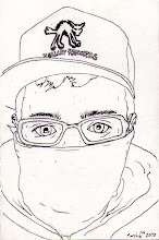
Drew myself up some icons for the different categories within my gallery.
Set it into the dreamweaver, fiddle with the layout and sizes a bit. Then preview it in IE. At the moment i'm going to leave it as is and see what gets said at the crit on Thursday. But i'm thinking maybe grab the whole set and shrink them down into the middle a bit more, theyr'e a bit dominating at the moment.
Also you may have noticed that my twitter button doesn't seem to work properly in IE. Issue needs to be sorted.


No comments:
Post a Comment