Sunday 31 October 2010
Dogs For The Disabled: Play Bowing
List Item #2: play bowing. Another illustration for the Dogs For The Disabled website. Took longer than it should of really, I'm pretty slow on illustrator, getting better though. I like gradients.
Labels:
Ben Mercer,
bowing,
brussels,
Dog,
Dogs for the disabled,
live brief,
Uni
October 31st 2010: Freddy Kreuger
Happy Halloween y'all.
My favourite villian ever from probably my favourite horror movie.
It's amazing how they managed to turn a child molester into an anti-hero really.
Saturday 30 October 2010
October 30th 2010: Innocent As A Child
This guy's got nothing to hide. He's a good little boy.
Labels:
2010,
Ben Mercer,
chainsaw,
child,
Drawing,
Illustration,
Personal Work
Friday 29 October 2010
Dogs For The Disabled: Fetching A Treat Box
Here's Brussels again. He's list item #1: Fetching a treat box from the cupboard. Theres his treat box that he's just fetched. Not sure if I should of done it in action, definitely something to think about for the other 15 illustrations.
Labels:
Ben Mercer,
brussels,
Dog,
Dogs for the disabled,
Illustration,
Illustrator,
live brief,
Uni
October 29th 2010: The Strangers
"Why are you doing this to us?"
"Because you were home."
Good answer. Good film, not particularly scary but definitely made well. I love the guys mask, thats why I drew him. It's essentially a pillowcase with holes & stitching but its brilliant. I like pen outlines with pencil shading as well, it's good. Probably should've sharpened the pencil a couple of times though.
Labels:
2010,
Ben Mercer,
Drawing,
horror movie,
Illustration,
mask,
Personal Work,
the strangers
Thursday 28 October 2010
Dogs For The Disabled
So I've picked up a brief to create a set of 16 dog characters doing different things for the website of Dogs For The Disabled. This little fella is the first to come out of illustrator. He's not completely finished yet as he's not actually doing anything as you can see, but its half 1 in the morning & I wanted to post him before I went to sleep.
Backstory: His name is Brussels, he likes pork.
Labels:
Ben Mercer,
brussels,
Dog,
Dogs for the disabled,
Drawing,
Illustration,
Illustrator,
live brief,
Uni
Business Identity Slate Header
So as I mentioned earlier the letter head was not in keeping with the natural theme that goes hand in hand with the Native American thing. So I decided it would be better in slate. Heres a mock up photoshop situation of what it would look like, basically keeping the same layout as the original header but it would be scratched into some slate. Hopefully I'll be able to get my hands on some slate and actually make this but for now this will have to suffice.
A really quick mock up of the box that the slate would be placed into, the wolf is engraved on the top.
Labels:
Ben Mercer,
Business ID,
Illustration,
Matilda Joslyn Gage,
photoshop,
Uni
Business Identity Compliment Slip
For my compliment slip for Matilda Joslyn Gage I've kept with the Native American theme but taken it a little further. Instead of creating a traditional compliment I've created the concept for a gift of a piece of traditional jewelery that would be given out. This features the wolf emblem I designed. I would like to create this at some point but it might not be a possibility, especially with the teeth. So heres a vector I made of what I would like it to look like.
Overall I think this would be very effective as a compliment slip/gift for the period especially in the context of my subject. I also had the last tutorial for this project today which was a little confusing but I think I know what I'm doing now. The main aspects that came away from it were to create this (done) and to think a little more about stock to use for the paper based pieces. It was agreed that the business card is pretty much there & would look good if it was finished on cow hide/leather or something similar. The letterhead however didn't really fit in with the rest of the work as it was a little too modern and needs to be taken back to the same era. Some of the ideas that arose were: using slate, scratching into the surface in the same layout & possibly presenting this in a wooden box with the wolf engraved onto the front. Or possibly using hide again & then creating some kind of box/container for that to be presented in. Of the two ideas I prefer slate.
Labels:
Ben Mercer,
Business ID,
Illustration,
Illustrator,
jewelery,
Native American,
Uni,
wolf
Wednesday 27 October 2010
October 27th 2010: Stand Up Trousers
Stand up comedy is all about the trousers. And a little bit about the jacket as well... but mainly the trousers. I quite like this. I've been looking at a lot of David Foldavari work recently, he does a lot of small patches of dark amonst some outlines with a little colour.
Labels:
2010,
Ben Mercer,
Comedian,
Drawing,
Illustration,
outline,
Personal Work,
trousers
Business Identity Letterhead
After messing about with a lot of different layouts I came up with this one. Overall I think this works fairly well, I've managed to keep the type at the top in a small way but I found that using it for all the text was a little overpowering & distracting from the layout. I've also re-used the wolf here which would be a watermark, ideally this would be printed onto some rough/handmade paper to keep the natural feel throughout. The decorations on the page are Native American patterns which I felt would both be appropriate and add another dimension to the piece. I wanted to keep the second name & the meaning in as well so I've used that as the name on the address. I couldn't find an actual address for Matilda Joselyn Gage so I've created one from elements such as her birth year, husbands last name & city of birth. As a whole I think this is quite effective, it keeps in all the elements that I want to reflect about the subject & is also looks good.
Labels:
Ben Mercer,
Business ID,
Illustrator,
InDesign,
Matilda Joslyn Gage,
Native American,
Uni,
wolf
Business Identity Business Cards 2
A review of my business card came up with a few editing issues. Firstly I made the wolf on the front smaller so that it wasn't taking up the whole card. I also played with a few more designs for the front and came up with this which I quite like, I think the patterns work well with the simplicity of the copy.
Tuesday 26 October 2010
Monday 25 October 2010
October 25th 2010: Drink From The Weak
They are easier to catch.
Inks on some nice thick paper. The colours have rendered a little funny on the scan but oh well. 3 hours well spent I think. Halloween is fast approaching and I felt it was high time I did something zombiesque.
Labels:
2010,
Ben Mercer,
blood,
Drawing,
Girl,
Illustration,
Ink,
Personal Work,
Zombies
Business Identity Imagery
So I made an assessment of my selection of wolves & I felt this one was quite strong so I turned it into a vector which I think has worked quite well as it has kept all the quality in the lines, perhaps made them a little rougher even which is good.
The wolf dropped onto a cow hide backing, I toned the colour down slightly so that it didn't pop out too much and look really digitalised. I might need to make it a little smaller so as not to take up so much of the surface area as it's a little dominating at the moment.
A couple of quick designs for the back of the card. I wanted to keep it quite simple in order to keep it consistent with the front side. I think the second version here is better but still definitely needs some work before it's finished.
Labels:
Ben Mercer,
Business ID,
Illustration,
Illustrator,
Matilda Joslyn Gage,
Typography,
Uni
Business Identity Typeface
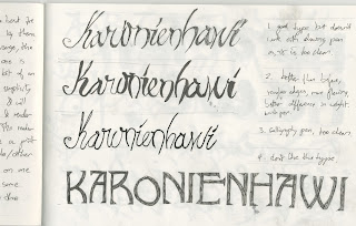
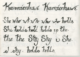
Below are some of the pages from my sketchbook where I tried to work out an effective typeface to use for this project. I wanted it to look hand rendered as obviously there would not of been printing technology to this level in the 1800's and also because of the nature of the work. I decided a cursive style would be best to use but in a brush pen to give it less of a structured feel.
The move to illustrator. I think this has worked fairly well, when I add this to the actual work I will probably change the colour slightly so that it's not quite so bold as this will take the digital edge off of it.
Labels:
Ben Mercer,
Business ID,
Illustrator,
Typography,
Uni
Sunday 24 October 2010
October 24th 2010: Gorilla Boy
As stupid as this fella might be, I actually quite like him. I spent pretty much all year on foundation designing stupid characters & looking at other peoples. Should of tried harder on the fists.
Labels:
2010,
Ben Mercer,
Drawing,
Gorilla,
Illustration,
Personal Work
Saturday 23 October 2010
Friday 22 October 2010
And Out Come The Wolves
Above are the less successful illustrations of wolves that I did for this project. After some experimentation I decided on the howling wolf pictured just above. I felt this had the most impact. I chose to use a brush pen to give it more of an earthy feel & stop it from being too clean cut as the drawing pen versions were. Below are the more successful versions of this wolf, one of which I will be using for the final illustration.
I like all of these, I was just trying out some different weight of lines in different areas along with some different levels of details to see what would work effectively. In terms of the purpose of the illustration: to be printed on to a natural/course material, the less detailed ones are probably more appropriate as they will render much more clearly and effectively. Final decision to come at a later point.
Labels:
Ben Mercer,
Business ID,
Drawing,
Illustration,
Uni,
wolf
Embossing Wolves
The wolf comes from the Iroquois tribe as well, as they were known as the wolf clan. It is also a strong icon/symbol for her personality as it means strength & fierce independence. This was an attempt at some homemade embossing techniques.
Labels:
Ben Mercer,
Business ID,
Embossing,
Illustration,
Uni,
wolf
Thursday 21 October 2010
Wednesday 20 October 2010
October 20th 2010: Karonienhawi
This illustration is actually part of my uni project but it took so long I thought I'd just use it as part of my one a day work. The woman depicted is Matilda Joslyn Gage who was an activist in America in the 1800s. She had many causes including Pro-Life, Womens rights, the Underground Railway and Native American Rights. The Native American part is obviously applied here & the name Karonienhawi is the name that the Iroquois tribe, who she spent time with, gave to her. It means 'She who holds up the sky'.
Labels:
2010,
Ben Mercer,
Business ID,
Drawing,
Illustration,
Karonienhawi,
Matilda Joslyn Gage,
Native American,
Personal Work,
Uni,
Woman
Tuesday 19 October 2010
Monday 18 October 2010
October 18th 2010: Butch Stripey Gorilla Man
Dodgey weird character design. Needs a bit of work, mainly on the face, but could be good for a Moon Street piece. Maybe.
Labels:
2010,
Ben Mercer,
Drawing,
Gorilla,
Illustration,
Ink,
Monkey,
Personal Work
Delayed Summer Project
So were back to the summer project that went AWOL. Today has been spent fussing with re-creations, paragraph styles, tech problems & generally getting back to grips with InDesign. After four trips back and forth from the printers we finally managed to get the files all correct and it's been set up to print. Photos to follow of the actual book, but for now heres some JPGs.
Front and back covers.
We wanted to keep this simple and effective and not overcrowd it. I think this has worked quite well by using the corners rather than setting up a standard title situation. I think it makes it quite interesting and unusual. The page size is 200mm by 200mm as it is a standard size which we could all work to & get printed cheaply. The grid we used was a 3 column grid, 12.7mm margins & 5mm gutters.
Inside front cover & page 1.
Again very simple leading into the book which I think is effective for the same reasons. I like the unusual layout. We used 'Eurostyles' 10pt for the body copy & 'Rockwell extra bold' for the title. The brief was to take elements of all four of our original layouts & combine them to create a consistent book. Body copy was chosen from Vicky Kwan's & the title font is from my work. We felt these worked well both individually and as a combination as both are easily legible but are different enough that they don't merge.
Page 2 & 3.
Re-creation of my original layout. The font has been changed to 'Eurostyles' to fit with the rest of the book, this meant I needed to make a few tweaks in order to realign the copy & stop any widows etc.
My layout was also the only one of the 4 to have running heads at the top so these have now been moved to the bottom.
Page 4 & 5.
Due to the slight change in page size & grid the image had to be changed in size in order to keep the composition correct. We chose to keep coloured questions throughout as all white looked a little plain. The questions are also in bold as 3 of 4 previous designs already has this element.
Page 6 & 7.
First set of Vicky's spreads. This was more of an issue as 3 of us had black backgrounds while Vicky's had full illustrations. We tried a few different things but in the end we elected to keep the imagery the same & make it contrast with the rest of the work. She also had a 1,2,1 set up of a 4 page spread rather than a two double page set up which meant a rearranging of her imagery in order to make it fit.
Page 8 & 9.
As we all used different colours in our imagery we felt it bet to each use different colours in our text as well that would complement the imagery so Vicky stuck with red.
Page 10 & 11.
Quite similar to mine in the colour scheme, the only difference is there is no space between the questions & the answers due to space issues it had to be compressed in order to fit the whole interview into the space provided & keep the composition interesting.
Page 12 & 13.
On some pages we have removed the running heads as it would of ruined the composition of the page.
Page 14 & 15.
Another black background layout, the main difference here is the use of colour which is blue instead of yellow so as to be consistent with the imagery.
Page 16 & 17.
Page 18 & 19.
Back to simplicity to fit in with the front cover & contents page. After our trips to the printers we had to add two more pages so as to create the required 4 pages for a signature. These are not shown here because they are blank.
Labels:
Ben Mercer,
Ellen Lupton,
InDesign,
Layouts,
Summer Project,
Uni
Subscribe to:
Posts (Atom)


