
Wednesday 25 November 2009
Overall...
I think that the work I have produced throughout this unit has been of good quality. I have enjoyed using a variety of different media, particularly ones that I haven't used before. In the next unit I would like to try and push this further, experimenting with more new media and combining them to create new styles of work for myself. I would also like to further my knowledge of the theory behind the work in order to create more meaningful pieces.
Tuesday 24 November 2009
T'was The Day Before Deadline
And all the work is done. Hurrah. Only a few academic bits, putting things in the right places and such. Bring on the next brief yo.
Monday 23 November 2009
Visual Equations revisited
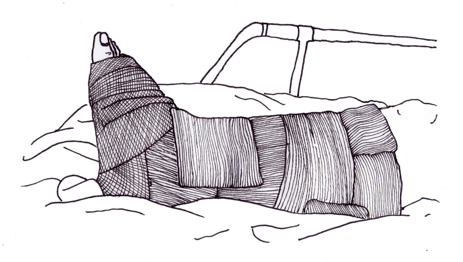
 So basically, having been ill and then missing the tutorial, I went to the second one to discover I was heading in the wrong direction. Here are some more images I did that i'm actually going to use. The main pictures will be on the front of a greetings card with text such as "happy birthday" etc. The logos will be on the back.
New baby.


Birthday Card.
 Get well Soon.
Christmas Card.


Easter card.


.
Valentines card.

Tuesday 17 November 2009


Visual Equations and such

The theme being opposites I decided to draw zombies. hurrah.
I had a lot of time on my hands having had swine flu and all so i painted this. All in all I think it turned out really well. I particularly like the colours and tone I managed to work into it especially in the largest face of the zombies. I think the detail and layers of colour in amongst here are very effective.Anyway, so i have to add some opposites to this to make it appropriate for the project so here it is. A Valentines day card.

 I think this also works pretty well, the juxtaposition between the painting and the white space really exaggerates the differences between the concept and colour of the zombie painting and the script text and the flat bold imagery of the love hearts underneath.
Not that this has anything to do with the project whatsoever but as I said I had a lot of time on my hands and wanted to draw zombies. Used an old photo of me so this is essentially zombie me.

 These pieces were looking more at the opposites that I could find within media. The combination of found imagery of bodies and quite basic drawing I find quite interesting. I like the use of the ink dripping down the torso obscuring the face on the piece on the left. The piece on the right I introduced a comic element to by adding the sign in between the legs that says "open soon." I don't think that they are as effective as the zombie valentines piece as the concept isn't as well developed.
This piece was based around the opposites of opinion and reality. For instance the red blooded republican American has been inverted here. Instead of saluting the flag he is standing on it, and instead of its usual straight bold lines it is coming apart. The stars are also replaced with an obscenity. The image of the penis towards the bottom also further the obscenity of the image. The fact that the gun is emerging from the bottom of the organs with the classic Nixon tag line "I am not a crook," is symbolizing that the "American Dream" is comprised of lies. Finally there is the addition of the text "bulletproof" which is a comment about gun control in the US.
I think the use of the juxtaposition of space and paint is very effective here again, with only a couple of parts jutting out and breaking it up. The color is also very similar throughout, using mostly reds and oranges except for the small section of blues and yellow which really draw the eye to the important sections of the image.
 This piece on the right I don't really like, I think it is far too simple and the idea wasn't that great. Simply taking a well known phrase "an apple a day keeps the doctor away," and turning it on it's head. I think this could have been better if i had come up with a better way to represent it.
On the left however is a piece that I do like; a complete inversion of a standard typeface. The alphabet starts from the middle. The lower case are bigger. The hierarchy is a spiral, however in order to see the letters the right way up the viewer has to rotate the image in the opposite direction of the spiral. This leaves half the text reading left to right, and the other half right to left. I added the red spot to the middle to draw attention to the beginning of the sequence, I tried it with just a black space but it wasn't obvious enough to draw the eye in. I think that white on black was a good idea as it is another opposite to the standard.
Tuesday 3 November 2009
More Letterpressss......


One of the first pieces I did on the idea of "sequence." Obviously it is the sequence of life.
I think the blue letters through the middle of it work quite well to illustrate the point, I'm not sure which one i prefer, I think that both work quite well in there own ways, I like both the straight and the angled blue text but I think the printing of life across the bottom of the page on this> one works particularly well.
I think the blue letters through the middle of it work quite well to illustrate the point, I'm not sure which one i prefer, I think that both work quite well in there own ways, I like both the straight and the angled blue text but I think the printing of life across the bottom of the page on this> one works particularly well.


This is apparently not a riot. I'm not too sure what this one was about really, just experimenting I guess.
Going, going, gone. I really like the use of the fading tone to represent the words.
Going, going, gone. I really like the use of the fading tone to represent the words.

Boundaries.
I wanted to experiment with different inks and different types of paper so i tried this one out. I think it worked fairly well but I think I should of used a white ink to print onto the black card to make it stand out more.
I wanted to experiment with different inks and different types of paper so i tried this one out. I think it worked fairly well but I think I should of used a white ink to print onto the black card to make it stand out more.
Letterpress

More to follow.
Rethinking Regeneration

I used photoshop to enhance the colours slightly and to make the lines bolder as the scan took away some of the quality.
Sunday 1 November 2009
Book Binding


So we did a book binding workshop which was highly enjoyable. This is the first book we had to make, I didn't like this very much as it was a bit too simple and made pretty much out of paper and so couldn't really be used in a real world setting.
I used it to write up book binding in. The only thing I did like was the use of coloured stock on the inside to make the pages.


 This is the second book we made which I much preferred as it is a hard back book with a spine and so I found it much more realistic. I used a spine section on both sides of the book so that it opens out properly. I also used various stock to make the pages to give it a handmade feel as well as using different sizes of page to make it more interesting and give it strange compositions inside. I also made a textiles spine cover for it to stop the thread getting snagged/broken and to make it look a little better. I may also cover the rest of the covers although I'm not really sure what with.
Overall I'm really pleased with it and I am going to use it as a sketchbook at some point.
Subscribe to:
Posts (Atom)
