Here is my dissertation. I wrote it. It got rave reviews already:
'That was a brilliant read!!!! thank you for sharing it brother' - Godmachine
'A pleasure to read.' - Paul Roberts
'Was alright i guess' - Ben Darvill
Abstract
What is the most important factor in contemporary illustration; is it style, or is it substance? Why has there been such a decline in what might be referred to as ‘traditional’ illustration, whilst authorial illustration is booming? And how can a contemporary illustrator best utilise the current environment to ensure long-term, gainful employment? Understanding and exploiting the answers to these questions is vital to the contemporary illustrator; to be aware of the occurrences in the field is key to being successful.
I will be analysing each of these questions, and more, to determine my own answers and understandings by looking at both the writings and the illustrations of contemporary illustration practitioners. I intend to surmise the pros and cons of client based illustration and authorial illustration and ascertain, if possible, the balance of the two which would be most beneficial to creativity and development, as well as finances and popularity.
Illustration – The Balance
In this essay I will be looking at a few elements of contemporary illustration practise including the introduction of new technology, promotional tools, style, authorial illustration and commissioned work. In particular I will be focusing on the surge of new authorial illustration work and the importance of the balance between this ‘free work’ and the more traditional client based work as well as the implications of doing so through examining the work of illustrators, interviewing illustrators and comparing texts on the subject.
In recent years there has undoubtedly been an increase in the amount of self-initiated work coming from illustrators worldwide and there are many reasons as to why this might be.
One of the most prominent, and certainly most written about reasons is the development of technology and the blurring of lines between the roles of ‘illustrator’ and ‘designer’. Heller (2000, p.23) states that in particular he finds the PhotoShop development to blame for this, saying that ‘Once, graphic designers depended on the rendering skills and conceptual acuity of illustrators. Now they can assemble ersatz illustration-collages by themselves,’ meaning that there are fewer opportunities for illustrators to work in the traditional manner. However, Vienne (2000) makes an interesting point that this can swing both ways, whilst designers might be learning more of the skills which allow them to illustrate, illustrators are learning design skills. ’The trend is profitable to illustrators in particular. They are brought into the creative process earlier, and their signature style is now considered an “integral component of the visual strategy.”’
An extension of this problem comes from the internet and the wide range of stock images now available. With the exception of some publications more and more stock imagery is being used. As Sterman (2000) says:
...after all, if one can rent a decent if generic picture, free of risk because it already exists, at bargain rates, with same-day delivery via e-mail...
This option is now considered an accessible, inexpensive, and hassle-free alternative to commissioning original illustration (Heller, 2000, p.23).
These revelations in the design industry mean that less traditional illustration work is published. This in turn has lead to a vast reassessment of terms. The title of ‘illustrator’ is constantly being reassessed and developed to encompass new areas of work, media and styles that were previously unthought-of or simply did not exist and this surge in authorial illustration is no different. It has come about due to a decline in work and a need for new outlets of work for illustrators.
While the drawn and painted (and computed) image has entirely reasserted itself in animated films, illustrated novels, and cutting-edge comics, and surfaces of skateboards, snowboards, and other paraphernalia of youth culture, editorial illustration, which once formed the spine of the art, suddenly seems to have become part of our history... (Sterman, 2000, p. 29)
This could be due the fact that illustrators realise that they are likely to get more exposure among a certain crowd by aiming at these new types of brief and so tailor their work to fit, rendering their styling less suitable for editorial illustration. Or possibly whereas the subject matter in editorial illustration is rigid and restrictive, the content of the ‘paraphernalia of youth culture’ gives the opportunity for creative freedom which could offer an illustrator a sideline to break away from the limited briefs of regulated editorial work.
The responsibility for content in authorial projects has allowed illustrators to embrace the many possibilities presented by new media (Noble, 2003, p.12) and is favourable as it gives a lot of freedom to experiment with techniques or content that might not be suitable for their existing client base. If an illustrator wishes to sustain any great period in this direction they must, of course, capitalise on it and so the development of this authorial school of illustrators has lead to a need for not only a client base, but also a fan base. In the traditional system an illustrators work would be shown, by an agent, to clients. Alternatively it could be sent straight to art-directors, published in annuals or seen at exhibitions. However in these modern times, more promotion is needed to draw greater attention to your work and propel you above your peers.
‘i pretty much just rely on the internet now, i dont really do any promotion except for online.’ (Mumford, 04/11/11)
The internet and current speed of communication has also brought about an increase in speed of changes within illustration. Trends can change so quickly now since images are now instantly viewable online and could be uploaded within minutes of an illustration being finished.
This seems to be the trend among illustrators created authorial work. As there is no client, the work is not being used in publications or campaigns and so isn’t reaching a wide audience on that level, instead portfolio sites, blogs and social media have taken its place, creating an online network of creatives and bringing a new demographic of art buyers to illustration. As Zeegan (2005, p.80) says ‘No longer indulging the needs of dull business-to-business corporate clients, a savvier, more fashion-conscious, streetwise illustrator had started to create images for an audience made up of its own peers.’ Of course some traditional methods are still used, such as exhibitions and magazine articles, but they pale in comparison with the possibilities of promotion on the internet. Noble (2003, p.26) writes that:
The traditional ghetto of self-generated work is reinvented through these electronic means, allowing not only new forms and approaches to emerge, but also providing some form of guarantee that the work will be seen.
These new viewers are important for illustrators as, for the first time ever, it is getting easier to become a well known in the illustration world. ‘People are able to be stars from their bedrooms with their cracked copy of photoshop, they can school themselves, get clients and make a name for themselves.’ (‘Godmachine’, 03/11/11). The upshot of this is that the wider your audience, the more likely you are to sell some work, and once this has begun you can develop wider ranges of work for sale, such as monographs, clothing and vinyl toys which are all popular items to develop amongst contemporary illustrators.
However, there are still certain elements which will propel you towards popularity faster. The main one being style. If an illustrator’s style is currently fashionable, then it is much more likely to move about social network sites, receive more views and ultimately claim more profit. The problem with this, Heller (2004, p.64) writes, is that
...the style of the moment, whatever it may be... has a proscribed shelf-life before going stale or turning rotten. So the danger for an illustrator in relying entirely on style as his whole equity is that when it falls from popularity (and it will) the paying work will doubtless dry up too.
There are of course, exceptions to this rule, where the illustrator (or their style) has become so well known that his/her style will sell at any time. Take for example Fig 1, an illustration from 1970 by certainly one of, if not the most recognisable name in British illustration: Ralph Steadman. Steadman’s use of linear shapes and cross hatching coupled with grotesque imagery and ink splots are instantly recognisable. Here we can see a jockey on a race horse with the reigns being held by the owner, whilst a crowd looks on from the background. The first thing to notice is the proportions of the image. Although jockeys are small and race horses are enormous, Steadman exaggerates this size-gap even further in order to commentate on the relationship between the two in a humorous fashion.
Fig 1.

The proportions of the horse itself are also exaggerated, with an extra high rear end and stick-like legs to comment on the breeding of thoroughbred horses for particular traits. An element of humour and risqué is added to the imagery through the addition of a large penis to the horse. The owner of the horse is of a blue-print Steadman character, reused in many of his works; suit, tie, bulbous face and cigar hanging out of the corner of the mouth. This ‘Fat Cat’ character is repeatedly used to mock those in positions that Steadman finds pompous and corrupt. All of these elements are indicative of a Steadman work, the thought process and representation of character and ideals within images is as much a part of his style as the physicality of his marks. The clean lines of the back of the horse fade out into a crosshatched, watercolour front end and on to a heavily hatched owner, building the detail and colour around the most prominent point of the image. The remaining image is roughly filled in with hints of faces, simple lines and a dash of colour. This technique of pulling focus to important points through density of line and colour is classic Steadman, and runs through a lot of his work.
Fig 2.
Look now at Fig 2, another illustration by Ralph Steadman, this time from 2011. This first detail of note is that though the images of Fig 1 and Fig 2 were made 31 years apart, and there may not be so much open space and cross hatching as the Derby image, the inherent style and feel of the work is exactly the same. The scratchy lines of the bird’s legs mimic those of the horse. The grass and bodies of the birds are loosely coloured, giving a vague impression, whilst around the heads of the bird the detail comes into play; again Steadman focuses the eye on the important areas through the use of density of colour and detail. The loose style of the flicked feathers and the ink splots in the background are intrinsic to his work. Heller (2004, p. 65) writes:
Ralph Steadman’s violently splotchy, linear style if not just an incredibly expressive way to vent his rage against cultural and political bêtes noir; it is an extension of himself, or, to put it concisely, it is his voice. When style is a voice it is not to be turned on and off capriciously. It is something that is endemic to the persona of the artist.
This is the reason that I believe has allowed Steadman’s work, and also his style, to stand the test of time. It is so organic to the artist and is not at all contrived to be in trend. Subject matter is also a constant through Steadman’s work with continued references to corrupt politicians, the ugliness of society and making jibes and snaring remarks about those he finds disreputable. His work was propelled into the limelight when he began to work with Hunter S. Thompson where the madness of Steadman’s visuals matching the story-telling of Thompson the two meshed together perfectly and over 40 years later the pair still have a following which no doubt has helped to keep Steadman afloat.
So we can see already that style isn’t simply about the visuals, it can also be about the thorough processes behind the work, and the way that thoughts and opinions have been portrayed. However, this is much more common with the older generation of illustrators. One issue that has arisen because of this trend towards authorial illustration is the lack of content or context in imagery. Previously an illustrator’s task was to visually describe a subject, such as an event or an idea, giving them the context and ideas behind the work. But with the imagery becoming the focus of the process, there seems to be a lacking in context, ideas or points of view being hidden within contemporary illustration work. When asked the question ‘Would you agree with the statement that illustration has become a lot more focused on style than on the ideas/context behind the imagery?’ Godmachine (03/11/11) replied:
I think this is so true. I think its because people today are lazy and fucking moronic. They dont want to stand in front of a picture and ask why the artist is using 3 magpies and what the position of the lady may suggest...
This seems to be the general consensus with most illustrators, with Mike Giant (08/11/11) adding ‘I think that's just symbolic of our world in general. People rarely look past the surface in our time.’ Conversely, Dan Mumford (04/11/11) takes a different stance on this matter. When posed the same question he responded that he felt the content becomes less important when it is for a client (as it is less personal to the artist) and the money becomes more important. Whereas if you are doing the work for yourself “then it is probably 100% all about the idea,” which gives a very different work ethic, showing that some illustrators may push themselves harder to create interesting content and portray their points of view when they feel that the work is more representative of themselves. This is understandable as client based work would not always allow for an illustrator to put forward their own motives. Heller (2004, p. 63) says ‘style must not be viewed as the be-all or end-all but rather a function of art, not the reason for it.’
But forming this unique style in itself is a difficult balance. Firstly an illustrator must find a suitable medium that is organic to the way that they work and does not feel forced. Ideally the style should be instantly recognisable but at the same time must develop and usually try to keep up with technological or industry based developments. However, an illustrator must be careful when developing their style and although trends may help to forefront your work for a little while, due to the speed of change in illustration trends you can be out of favour quite quickly. Godmachine (03/11/11) suggests that whilst it is important to keep up with current trends and popular culture within the industry, in case some of it applies to you, you should not let it affect your work. ‘you see so many artists changing their styles on a dime- and they get a lot of work for it- its a handy skill to have but I doubt you will make a name for yourself’. Whilst being flexible and versatile in your work can be a good thing, using too many different visual languages will lead to an inconsistent portfolio, leaving clients unsure of what they would receive on hiring you, and the public unsure of whether they like your work. Finding that balance is essential, if an illustrator’s work is too different, it may stand out from others, but will also go past the point of saleability, whilst if it is too neutral, it will not stand out enough (Heller, 2004, p. 64).
Take for example, the work of Han Hoogerbrugge (see Figs 3 & 4). His work is consistent in style no matter the brief. Hoogerbrugge (cited in Zegan, 2005, p. 116) says:
My personal work and commercial work are often close together. I get asked for commissions because of what i do with my free work and I can only do commercial jobs if they relate to my free work.
Fig 3.
Fig 3 is an image of some of Hoogerbrugge’s ‘free work’, made for personal use and promotion. We can see that the style used is very flat and graphical. Thick, bold lines surround areas of flat, block colour in a monochrome format on a plain background. The juxtaposition between the flat white of the shirts and the black of the trousers creates a striking image, despite their simplicity. A small amount of detail is given with concise marks to emphasise some areas and bring out the features in the face. He is an illustrator of the same line of thought as Dan Mumford, as Hoogerbrugge (2007) gives some complex explanations for the content of this work, writing about his created character:
…The internal battles of a stand alone man. He tries to deal with the outside world by creating a world on its own. In this personal universum he is free to explore his feelings and fears… A modern man with cultivated tastes and primitive senses that one senses is equally comfortable holding a Martini or a machete…
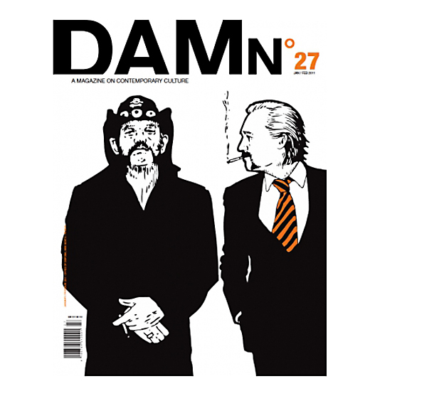
Fig 4.

Fig 4 is an image of a commissioned piece by Hoogerbrugge for the cover of ‘DAMn’ magazine. There is a slight change in aesthetic but this is only to be expected over a five year period. The basis of the style however, remains the same. We see the same thick, bold, lines encompassing the face of the figure on the right hand side, the same block colouring for the clothing and another plain background. The strength of the large sections of pure black set against the white of the background and incorporating the white of the hands and faces makes for an incredibly bold image in the same way as Fig 3 does. We have a little more detail in the face and hair than previously but it is still fairly minimal. The main difference seen between the two pieces is the addition of colour into the work through the tie. This has been chosen to match the colour palette of the title and to tie the whole cover in as one piece rather than separating the type from the imagery. This pair of images are an excellent example of how both authorial work and client-based work should inform each other.
Hoogerbrugge (cited in Zegan, 2005, p. 116) goes on to say that he thinks that his consistency in his work is one of the main reasons that he gets a lot of commissioned work, art directors know what to expect from him. But on the subject of preference he states:
‘...if I could make enough money with my own work I probably wouldn’t do commercial stuff.’
This seems to be a very common outlook on the illustration business, that whilst commercial work might provide the money and publicity required to continue working as an illustrator, if it was possible, many illustrators would prefer to take the self initiated route. However, he goes on to say
‘On the other hand, it’s nice to do something else every once in a while. Working on your own stuff all the time can make you blind. Commercial jobs can create a healthy distance between me and my work, and give me a better perspective on what I do.’
Finding a balance between these two hemispheres of work is what will ultimately make for interesting and informative work. ‘... Coming from much self-initiated work are spin-off commercial projects. These commence because of an illustrator’s desire to work in new and different areas of interest...’ (Zeegan, 2005, p. 114) The self-initiated work brings new ideas and techniques out which can then be used within the commercial pieces, which can sometimes force ideas that might not have been forthcoming, had the illustrator been left to their own devices, although there are many viewpoints on this subject.
Weaver (cited in Arisman, 2000, p. 12) argues his approach, saying that ‘Concept and problem solving for clients is of no concern for me. I am trying to tell a simple story in an interesting way... That is what separates illustrators from art directors, designers, and photographers. You are not a co-worker. You are a collaborator. This is an important distinction.’ By separating himself from the group and not allowing himself to be put under the jurisdiction of others, Weaver turns client based work into something far more personal and closer to authorial work, allowing him an input of his own ideas and views into the process, rather than just representing others. On the other hand Godmachine (03/11/11) takes a more straight forward approach to his balancing of the two, suggesting that client based work helps you to gain a better understanding of the art world, the finances, clients, art direction, styles and trends, whilst authorial work is simply for self expression and development. He also makes the point that authorial work is perhaps more to do with being an artist than being what is coined as a traditional illustrator, whilst Dan Mumford (04/11/11) uses self-initiated work simply to stay motivated and engaged with the illustration world. So we can see that there are many different approaches and views on the line between commercial and authorial work and each illustrator must find the balance that is right for them. Whether one informs the other or you prefer to separate the two, or simply try to follow one as much as possible, the key to success is to develop your work but be consistent in your style.
Whilst it is good to be consistent in this way, it never does well to be too consistent and to have your work overexposed as illustrator Jean-Philippe Delhomme discovered after an advertising campaign for Barney’s (Vienne, 2000, p. 6). His work became so well known that offers of similar work came flooding in. Delhomme (cited in Vienne, 2000, p. 6) said ‘I was terrified, this was the end for me. I was branded!’ In Fig 5 we see an example of Delhomme’s work from the afore mentioned campaign and we can begin to understand why it was so easy for him to become branded. His style is very unique, using painted imagery in quite a childish fashion, combining simplified form with flat colours whilst maintaining the essence of the characters and a mature feel through his use of slight details, composition and body language. In the words of Vienne (2000, p. 6), illustrators ‘are finding that developing a new persona once you’ve played a successful role is a daunting task... as soon as they become icons, their illustrations, however provocative, lose their ability to delight, intrigue, or even offend the viewer.’ All of these aspects that are lost are what traditionally made illustrations unique and built the foundations of the industry. However, with this, as with anything, there are the exceptions.
Fig 5.
In some areas of the illustration field it is acceptable, even important and profitable, to develop a style that is so well known that it is commissioned, or at least bought, over and over again. A prime example of this is in graphic novels or comic books, where repeated artwork and characters gather followings. This following can help propel illustrators into the limelight, such as Spiegelman, the creator of Maus which was originally ‘published in instalments inserted in the groundbreaking magazine, RAW, designed and edited by Spiegelman and his wife.’ (McCloskey, 2000, p. 94) What started as a humble illustration project has rocketed to success and fame, being the only comic book ever to receive a Pulitzer Prize. Alan Moore (cited in Wikipedia. (2011). Maus. [online].) claims that ‘Art Spiegelman is perhaps the single most important comic creator working within the field.’
A very different example of an illustrator breaking away from traditional work completely and divulging themselves purely in their self-initiated work can be found in Fig 6 and the work of Sheperd Fairey. Fairey’s Obey campaign began solely as an underground movement to capitalise on the recognition of style in modern culture. In Fairey’s own words:
Fig 6.
‘The Giant campaign simply pokes fun at the process by teasing the consumer with propaganda for a product which is merely more propaganda for the campaign.’
In other words, Fairey, unlike other illustrators is purposefully attempting to become known for working solely in one style. This flat graphic style visible in Fig 6 can be seen throughout all of his work. The use of strong, bold colours taken from the constructivist era, particularly the red and beige, are often repeated as is the use of line and type. All of these thing combined create a style which is instantly and irrefutably recognisable as a Fairey piece. The final nail is to add the ‘Obey’ logo to any piece. Fairey’s style has developed over the years to use more detailed work and different content, but has done so slowly so as not to lose his audience. Fairey has created, in his own work, a brand which is now extremely fashionable to buy as clothing items, prints and other merchandise simply by playing off of society’s nature to obtain anything that is deemed fashionable. By creating such a solid fan-base through unusual means, he has eradicated the need for traditional illustrative work and can be completely authorial in his work.
The question of balance within illustration is a large one that encompasses many aspects of the industry. The argument of where to draw the line between illustration and design, if indeed we should draw one at all, is prominent and ongoing. I think that the answer to that question is individual for each illustrator and what he/she perceives as ‘illustration’ at any given time due to their background and their influences. The merging of design with illustration will either be accepted or rejected by each, depending on whether they consider progress and development to be key, or whether they champion tradition. The balance between authorial work and commercial work is a prominent talking point in the field more so now than ever. As shown there are many viewpoints on this topic and again each illustrator must choose what is right for them and take into consideration the trajectory of their career and where they want to end up. Style will never cease to be at the forefront of any illustrator’s mind. Considerations must be made all the time with regards to media, line, colour, tone, but most importantly how to find that balance between recognisable and repetitive, between over the top and too bland, between popularity and trend follower. As for myself, I think that it is important to have client-based work in order to gain larger exposure to further clients, authorial work should be used to not only create a distance between you and constrictive assignments but to also explore your own ideas and further your style which should be organic to each individual illustrator, but also be adaptable without compromising it, in order to hit different briefs. In short, I agree with Rees (2000, p. 39) who writes:
I believe that the continued relevance of illustration lies in the intelligence brought to bear in picture making and in the ability to embrace continuing change... The greatest threat posed to illustrators and their livelihoods is in continuing traditional thinking in this greatly changed arena of activity. The “new” fashionably pixelated illustration may be today’s darling, but the future of illustration belongs to the mutants.