
I spent all day reading books about semiotics and looking at websites and then biographising them in the correct harvard format and stuff. Basically I spent about 6 and a half to 7 hours working today and now I'm ready to do my essay. Eugh. Essentially I just have about 7 pages of quotes from various books which is probably about half the required length of the essay so at least I won't have to think that much.
I also realised today how much more interesting stuff I have to read. I've got 2 whole copies of Juxtapoz that I haven't had a chance to look at, along with the winter issue of illustration, an issue of territory and other none art related things. Anyway, it just annoyed me that I spent all day reading books that all begin with "the theories of..." rather than interesting bits. I haven't even had time to draw any zombies or splash red ink on some pages. Lame. Well it's new years tommorow. hurrah. I don't know who I write all this stuff for, nobody really reads my blog. I just like to vent. If you have read this. Let me know. Maybe you'd like to strike up a conversation about popular culture, semiotics or gender in the media. Or a complaint about these topics. Let me know.
Wednesday 30 December 2009


Tuesday 29 December 2009
More again. pufut.
 And now my printers out of ink. So I can't print out any more designs to do any more sketchbook work which is what I really need to do. FANTASTIC. And I lost my metal ruler. lame.
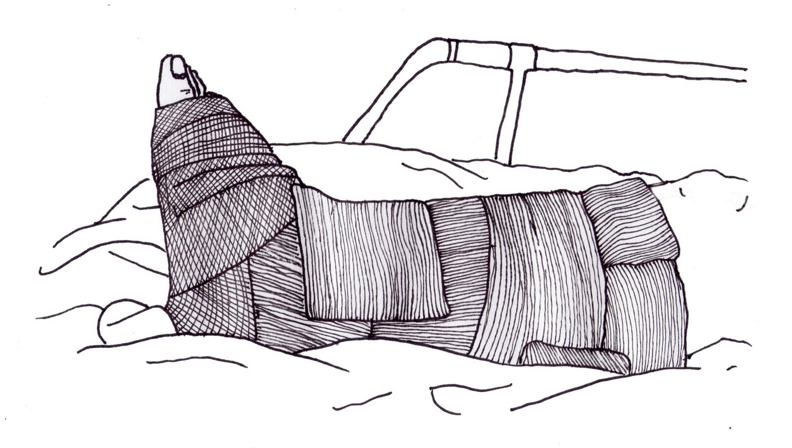
Anyway. I know this looks almost extactly like the other one before, but if you look very closely at the shape of the outlines just to the right of the zip it is infact the shape of Bangladesh.
Just thought I'd put it there for extra effect.
Poster Drawing

Anyway, I had a go at drawing the label and the coat situation.
Here it is. Worked all right but due to the massive blackness on the left hand side their is a giant space with nothing in it which I don't really like at all.
Anyway, next step.

I got some new inks yo and wanted to try them out so I busted this out. Not a great difference but a little colour making the label pop I think works well.
Anyway, since it's all nice and shiny and white it should be easy to bust some good copy on top of.
More Ideas For Posters
WHY WON'T YOU LOADDDD

 Ok, so this set of images that is now working, hurrah, is based on the idea of a christmas present containing a help me tag.
they told me I'd have good reception here. MASSIVE LIE. I might attach a giant radio antennae to my laptop and see if that helps. EUGH.

 Ok, so this set of images that is now working, hurrah, is based on the idea of a christmas present containing a help me tag.
 I think they've worked quite well as the wrapping paper serves as a frame and also creates an odd shape to everything. I like the colour palette on them and I think they are quite strong.

On this one I tried to make the wrapping paper at the bottom leave a space for me to write some text on where it would be easily visible which I think has semi-worked. We'll find out when I write on the fucker.
Black Box

 So the concept of black bow is that it is another team activity. Each team is given a black box with the name of a product inside. Our item was Fairtrade Banannas. We then had to draw visual clues to represent the item. We drew a bananna leaf, a clowns shoe (because they slip on bananna skins), a fairground, a market, a block of yellow and some other bits that I can't remember. Each team then trades boxes with another team and you have to try and work out the product that they were trying to describe.
  So heres what we got back. Loads of pictures of mint leaves, clocks and other associated minty bits like toothpaste logos. It took us about 5 minutes to work out it was after eight mints. Which is considerably less than it took the group who got our box to figure theirs out. Cryptic win. Anyway so we brainstormed and researched for ages, bounced ideas off of each other. The brief was simply to come up with an advertisement for the product, no format or other instruction. After a long debate we decided to go with something that none of us had really done before: a video. We also decided to play off of a pre-existing idea which was the after eight challenge where people try to slide the mints down their faces without using their hands. It turned out to be an awesome idea. So we went and bought some after eights, set ourselves up with a video camera and started shooting. After shooting we had some pretty major technical problems with the file formats and had to go back to Chris's to sort it out. We were none too pleased about that. After pissing about with file conversions we got the files back to uni and discovered the sound was at normal speed but the filming was double so we cut the sound, put a backing track on and edited it up in about an hour before the crit happened. All in all for how rushed we were with it and how little any of us knew about video production or editing I think it's turned out extremely well, which I would put down to extremely good group dynamics, nobody was afraid to voice an opinion or suggest something new, ideas were bouncing around all day and the idea changed from one minute to the next as the suggsetions were made which I think was why the video worked so well. Not entirely sure how to load the bad boy up so heres a link to it. Make sure your music is off for full effect.
Democracy Day
Rghhh,
none of the images will load for some reason so I guess I'll just have to write about the great event.
Basically this was the first group day task. We were split up into groups of 5 or 6 and were given the brief to produce a poster based around the idea of "democracy." Pretty open brief all in all. So we got to work brainstorming and stuff and came up with a few different ideas. The central theme we wanted to go for was to mock democracy and it's failing, how useless the election system is and how the government is in fact not a democracy as they ignore the voice of the people. We agreed on this but had some differeneces in creative opinion in regards to the poster, as was wont to happen. So we split into two sub-groups, each researching different elements and working on seperate poster designs. My research was based upon govenment manifestos and how, although these are the promises that get them elected, they often fail to produce. The public knows this and yet still continues to vote for the big parties. Anyway, I discovered that of it's last manifesto Labour had only managed to produce results on 3 out of 9 big promises, only a third. We felt this was a strong figure that could be central to the copy of our poster. So that's what it got designed around. In retrospect I think the message given was very good but because we spent so long buggering about researching the relevant information we had a lot less time to create something visually interesting and so the poster was quite weak. It also didn't help that I had to create it when I suck on computers. I think the group didn't work together particularly well as a lot of people sat out whilst a minority did the main work.
Monday 28 December 2009
To Do List:
Mainly for me:
- Democracy poster write up...done
- Black Box write up...done
- poster photos...done
- creation of posters - involving addition of type and logos.
- experimentations...done
- drawing in general
- write up poster shit - has to wait until posters are in fact done.
- draw some zombies... a couple...more needed.
- test out spray varnish I bought today... massive fail. bollocks. hmm.
- ESSAY, OH SHITE.
- creation of CV
Tuesday 15 December 2009
Photos for Posters


Basic idea is to have your clothing with the clothes tags asking for help. The tag lines and logos will be added and all will be well. I wanted to do two posters, one male clothing and one female clothing. Here are some photos.
All in all I think these work quite well, I've tried to make the labels prominent within the imagery to draw attention to them. I like the lighting on the clothing and have tried to exaggerate the folds and such.


The male ones I am unsure about which to go with. The top one is interesting but the label doesn't really stand out enough from the clothing because of the amount of red going on. Whereas the one below it has a good level of contrast between the label and the clothing but the composition is a little weird because of how far over it is, but could be interesting as a poster. I guess I'll decide once I've smashed some logos and tag lines across them.
The female one at the bottom is a bit dodgy because the light was really bad and i had to do loads of cloning to make the writing on the label legible. fail. The one above it I think is quite good though as the label sits in the darker half of the imagery and really stands out from the rest of the piece. The zooming right in on the clothes I think works really well as it takes away the complication of the figure and just leaves the clothing as the focus which I think would work well as an adshel poster.
The female one at the bottom is a bit dodgy because the light was really bad and i had to do loads of cloning to make the writing on the label legible. fail. The one above it I think is quite good though as the label sits in the darker half of the imagery and really stands out from the rest of the piece. The zooming right in on the clothes I think works really well as it takes away the complication of the figure and just leaves the clothing as the focus which I think would work well as an adshel poster.
I might bust out some drawings of some of these or something because to be honest I am so sick of working on computers, it feels like I'm doing absolutely nothing all day when I should be working and it's become depressing. I need to create something hardcopy rather than all of this digital work. Drawing is definitely required.
Monday 14 December 2009
Low Budget Project Version 3 - Clothing Tags


 So the basic idea was to give the idea that the sweatshop workers were sending out a message for help via tags that they would attach to the clothes that they are making. I decided to make them out of cardboard so that it looks low budget and they obviously wouldn't have the money or technology to produce anything more high tech. So i tried out a few different things for the front but decided to stick with the cardboard look. Again the idea would be that the designs could be placed on the WOW website so that people could create their own labels and put them in clothing made in sweatshops to help the cause. I used the war on want logo on the back with the web address to advertise it. I made the white of the logo a little transparent which I think has worked well as a design choice.
 Overall I think it's a pretty strong idea and could easily be converted into a poster design of some sorts. Already took some photos for that but haven't got them ready to put up yet.
Thursday 10 December 2009
Next Up
Next up on my low budget project list was AVERAGE WAGE PRICE noodles.
This seems to have worked really well since i keep showing it to people and they don't even realise it's not an actual Asda pot. Hurrah. Heres the label.
 Basically it has loads of information about sweatshops in Bangladesh instead of information about noodles.


This seems to have worked really well since i keep showing it to people and they don't even realise it's not an actual Asda pot. Hurrah. Heres the label.


I win.
Coming soon... Clothing tags.
Monday 7 December 2009
First Sticker Designs
O.k. So for this War On Want campaign I have to come up with a low budget idea. One of my idea's that I thought I'd run with was stickers. There's other ideas in the works but here's the first designs for my stickers.
 Design One.
The Fashion Victims tag is taken from a pre-existing WOW campaign but I think it works quite well to put a point forwards, taking a concept usually associated with consumers and reversing it.
The photo is also taken from the same campaign.
The addition of the question underneath the photo I think aids the image and makes the viewer think more about the concept.
 Design Two.
I don't particularly like this one due to the layout design. I don't think it is very effective.
I do however like the tag line I used here. The larger type of SLAVERY really draws in the eye and gives out a very important message to the imagery. The addition of "no matter how you dress it up" also gives it an extra interesting twist which i like.
 Design Three.
Using the same tag line as number two I think this one works a lot better, the eye is immediately drawn to the bold type of the important issues.
I also like the layout here, with varying leading and tracking on the type gives it an interesting effect.
 Design Four.
This is probably my favorite design of the first set.
Again the same tag line but the slavery even bigger here to really draw the eye, and having the text split around the image I think works really well.
The use of white space between the tag line and the web address I also like. The final piece I added was the use of the question under the web address, again to make the viewer think. I think this one is possibly the most effective as it is simple yet emotive.
 Design Five.
I think this one is overly crowded with tag lines and doesn't offer any information to redeem itself.
I don't really like the layout either, again too crowd and generally ineffective.


The Fashion Victims tag is taken from a pre-existing WOW campaign but I think it works quite well to put a point forwards, taking a concept usually associated with consumers and reversing it.
The photo is also taken from the same campaign.
The addition of the question underneath the photo I think aids the image and makes the viewer think more about the concept.

I don't particularly like this one due to the layout design. I don't think it is very effective.
I do however like the tag line I used here. The larger type of SLAVERY really draws in the eye and gives out a very important message to the imagery. The addition of "no matter how you dress it up" also gives it an extra interesting twist which i like.

Using the same tag line as number two I think this one works a lot better, the eye is immediately drawn to the bold type of the important issues.
I also like the layout here, with varying leading and tracking on the type gives it an interesting effect.

This is probably my favorite design of the first set.
Again the same tag line but the slavery even bigger here to really draw the eye, and having the text split around the image I think works really well.
The use of white space between the tag line and the web address I also like. The final piece I added was the use of the question under the web address, again to make the viewer think. I think this one is possibly the most effective as it is simple yet emotive.

I think this one is overly crowded with tag lines and doesn't offer any information to redeem itself.
I don't really like the layout either, again too crowd and generally ineffective.

Design Six.
My fonts gone weird.
Taking a different approach to the stickers. I think this has worked quite well.
Simple, hard facts in really bold type I think leaves the viewer to make up their own mind.
Wednesday 2 December 2009
War On Want
So the new project is to create an advertising campaign for a charity called War On Want. An adshell poster is needed, as is a low budget campaign in an innovative format.
Click below to goto the website.
War on Want
Click below to goto the website.
War on Want
Wednesday 25 November 2009
Overall...
I think that the work I have produced throughout this unit has been of good quality. I have enjoyed using a variety of different media, particularly ones that I haven't used before. In the next unit I would like to try and push this further, experimenting with more new media and combining them to create new styles of work for myself. I would also like to further my knowledge of the theory behind the work in order to create more meaningful pieces.
Tuesday 24 November 2009
T'was The Day Before Deadline
And all the work is done. Hurrah. Only a few academic bits, putting things in the right places and such. Bring on the next brief yo.
Monday 23 November 2009
Visual Equations revisited
 So basically, having been ill and then missing the tutorial, I went to the second one to discover I was heading in the wrong direction. Here are some more images I did that i'm actually going to use. The main pictures will be on the front of a greetings card with text such as "happy birthday" etc. The logos will be on the back.
New baby.


Birthday Card.
 Get well Soon.
Christmas Card.


Easter card.


.
Valentines card.

Tuesday 17 November 2009


Subscribe to:
Posts (Atom)
