
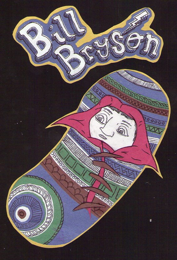
I've remade the paper, collage style baby. I think this ones better personally, it's got more strips of colour, more patterns, less markings on the red section & I think the face is much, much better. It doesn't look scared and is a little less cramped and the lines are cleaner. The type I also really like, I think it's much more interesting than the plain drawn text & it also stays consistent with the illustration. I've added the thunderbolt in there because it's for 'The Thunderbolt Kid', each one would have something related to the title/book. These are loose at the minute, not mounted on black but actually looking at this I quite like the black backing, I might have to think about that. The yellow around the type needs cropping down.

No comments:
Post a Comment