Showing posts with label Busker. Show all posts

Tuesday, 17 November 2009

Promo Print


Page 1 of my Booklet.


Page 2&3


Page 4&5


Page 6&7


Page 8

Wednesday, 21 October 2009

Illustrator Sessions

So here is the result of the first illustrator session.
We learned how to use the shape tools, align tools, colouring palette, and some other simple things.
Pretty straight forward.


The second Illustrator session we were looking at glyphs. We learned how to use the pen tool to draw shapes and curves, change the anchor points, move them about and create images.
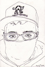
We then had to create our own glyph using these techniques. I had to choose busker man of course.
I think this has work extremely well considering it was the first time i've ever used illustrator to actually draw anything. The level of detail I think is just right to remain simple but to show clearly what the image is.

Saturday, 17 October 2009

Poole. Yeah.

It's so annoying to get the pictures in the right places on this thing. Anyway. Here... Is some drawings that i did in Poole. Or of Poole when i got home anyway. The First one is of Thames Street. I just liked the lamppost to be honest. It had a nice structure. The Quote is from this little round bollard down on the quay. I believe it's about Brownsea Island but i thought it was a nice quote so i added it in. I like quality of tone in this drawing, i think it works really well to give depth to the street and bring in a bit of character.

Number 2. Quay House down on the Quay (suprisingly.) I pretty much did a really dodgy pen sketch of it, it looked alright until i tried to add a load of stuff at the bottom to make it better. Ruined it. Thats why its got this big piece of red paper stuck across half of it. Turned out alright though. I liked how traditional this place still was. Traditional here could also be substituted for the words "tacky" and "touristy" but we'll pass that by. The line I used here i really like, as instead of sketching it in pencil first as is my usual want to do, i just did it in straight lines with a pen which i think has created quite an interesting, slightly childish effect which I think fits with the ideas here well. I think the lettering could have been thought about a little more to make it more effective.


Aha. The Fancy Dress Shop. Plain white shop with this rainbow writing across the front. Stood out loads. Wasn't particularly interesting other than that, which is why the drawing is pretty undetailed. Oh well. Poole High St. Provided some wonderous shops full of weird junk. I just liked the writing on this one.
I think the cross hatching takes the front of the shop out of the focus of the viewer and really brings out the coloured writing and also the blank space that is the door really draws the eye in contrast to the tone of the windows.


Sandwiches etc.? This shop was also plain white, pretty dull shop. I just found it slightly amusing that it had such an unimaginitive name. It sells sandwiches etc. I liked the writing and I also like it here, I think this type is quite effective.


Mortons on Poole High St. was another wonderous shop full of what seemed to be absolute junk. Ranging from the VW van canvases you can see coloured in beautifully in the window here, to some betty boop dolls and some weird ornaments made from twisted metal. Anyway, I thought it was interesting, really like the old people wandering past outside. I think it gives it a sense of place and character. I like the layers of information in  this illustration, with only small amounts in colour, making these bits really stand out, the figures in the foreground leading the eye across the image and the suggestion of detail through the window i think creates a strong image.


And where would I be without Mr. Rockstar. My favourite part of Poole. Ha. I've already explained him so here he is in acrylic and pen and all his glory. This image i particularly like, I think I used line really well here to create some nice outlines which are filled with a good mix of mid-tone and bright colours which really play off of one another to create a bold image.


I Give You Poole.

Wednesday, 14 October 2009

And on we go. The new Project begins.


So, started back at Uni. Foundation was good last year, summer was good. Now for VisCom. First week we went drawing in Poole. Took some photos. Drew some things. The project is based around the "Regeneration of Poole." This is the first part of "Text And Image." Drawings and other kind of things to follow shortly when i've managed to scan them all in. In the meantime heres a photo of the greatest busker ever.

I can imagine this guy dancing around his bedroom in the YMCA rocking out to Iron Maiden and playing air guitar.