More web design today.
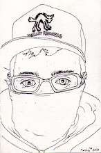
Bio page. Think this has worked really well. I like having an image to one side of the page and then the white space and text on the other side, this fits in really well with the whole feel of my site. I wasn't too sure what to write in my bio so I've left it a little generic and chatty for now. It works. I might change it at a later date if I decide I don't like it but I think it describes me pretty well. I think the text align right works well here as it sits against the imagery and leaves the space on the left
Contact page. I went with the image to the side, content on the other to keep the theme going throughout. Although I've switched the sides over because I wanted the lion facing inwards like the masked man is on the other page. I think the imagery works well but there's not a lot I could really do with the form as it needs to be pretty standard for people to be able to use it effectively. I might align the text to the left though. It looks a little disjointed in the middle. There were a few other little niggles that needed working out today, finally got my email link at the bottom working. Added the copyright line to the bottom of each page with the © symbol (alt g on a mac, new found hot key). The main problem though was that I discovered that on my gallery pages when you click a thumbnail the image was stretched across the entire main image box regardless of size. This was solved by removing all height/width measurements from the placeholder image as this was effecting all the other images. Then hooked up all my links at the bottom of the page. The only thing left to do now is create my 'design' gallery and then upload and check everything works.


No comments:
Post a Comment