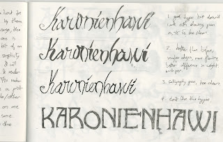
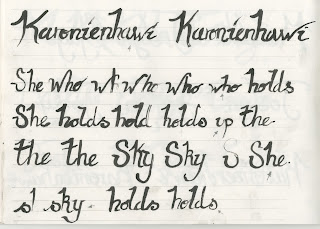
Below are some of the pages from my sketchbook where I tried to work out an effective typeface to use for this project. I wanted it to look hand rendered as obviously there would not of been printing technology to this level in the 1800's and also because of the nature of the work. I decided a cursive style would be best to use but in a brush pen to give it less of a structured feel.
The move to illustrator. I think this has worked fairly well, when I add this to the actual work I will probably change the colour slightly so that it's not quite so bold as this will take the digital edge off of it.


No comments:
Post a Comment