Yus.
New thing. Albhabetness.
I bought ink for my printer today.
That means I can print things.
Then put them on my lightbox.
That hasn't happened in a while
I like that.
Friday, 30 April 2010
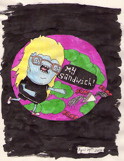
Thursday, 29 April 2010
Wednesday, 28 April 2010
Work Experience: 28/04/2010
So after yesterdays events of setting up our little studio company today was focused on coming up with ideas for advertsing strategies. We talked about what kind of clients we would want to work for. The short list came down to: record labels, doing illustration & design for CD sleeves/flyers/posters. Fashion, creating look books & advertising. Drinks companies, designing packaging & advertising and finally Charity, doing advertising. So after deciding on these we needed to come up with some way of getting our name & message to these clients. After a LOT of debating and throwing ideas around we came up with the idea of using the 'plus' sign from the logo to reflect a medical nature, and so to play on a gimic of being 'design doctors'. We then split into smaller groups to throw some more ideas about for this. My group came up with the idea of creating a mock first aid box containing some promo pieces. I was in charge of designing the box itself but we only had 10 minutes to do this in so it was a quick job. Here it is. Pretty simple design.
Into this was placed a business card,
a lollipop,
and a plaster (the image for which won't load). These elements were designed by the rest of my team.
Back of envelope box thing.
The Collection.
After pitching this to the whole studio it was decided that we had the best idea and were put in charge of craeting a more realistic version of this as a mock up. That's coming soon.
April 28th 2010: Murder! at the Disco
I would definately murder those guys. Anyway. Continuing with the 'Sin' thing. Simplesss. Dripping ink is win.
Labels:
2010,
blood,
Drawing,
hands,
Illustration,
Ink,
Personal Work
Tuesday, 27 April 2010
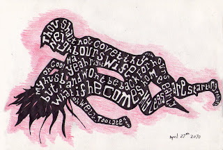
April 27th 2010: Adultery
Basically A5 magazine's next issue is based on 'Sin' so I'm gonna send in some bad illustrations and see if they're dumb enough to put them in.
Labels:
2010,
adultery,
Drawing,
Illustration,
Personal Work,
Sex
Work Experience: 27/04/2010
So today was the start of my work experience unit. We began with an overview of what we would be doing over the next two weeks. Firstly we would be creating a set of stencils to be sprayed onto the grass around AUCB to guide people an exhibition. We will also be creating a map for the same exhibition. Lastly we have been set a live brief to create a design for signs to be put up at Castlepoint shopping centre which will help mobility customers (those that are disabled/partially sighted/blind) to get around the shops. These will need to have both standard text on but also braille so they can be read by everyone.
As we are setting up a studio team the first task was to chose a name & design a logo for ourselves. We split into groups and my team came up with the idea of 'Comelion designs', being that we are visual COMunication students and we wanted to suggest that we were adaptable to any environment. This received good feedback but overall we felt that the name was too long and since it was misspelt it could be difficult to create a customer base. The end result was 'Thirteen plus one' which came from there originally being 13 of us and one person showing up late.
We then went about designing the stencils to be sprayed around AUCB for the show, we had been given a set typeface and the fact that they wanted it displayed within a circle. These were my designs. The first set on the left were the ones that I pitched. (This includes the large 2.) I wanted to keep them simple as grass is not a very accurate medium. I used bridges on all numbers regardless of whether they were necessary or not and stretched these through the circle in a straight line. These received good feedback but another design was chosen due to creative flair.
The chosen design was then split up and each person in the team then designed one number, directed by the chosen design director. This was then printed out across 6 A3 sheets, taped together, spray mounted onto some grey board and then cut out with a scalpel to create the stencil.
Monday, 26 April 2010
Sunday, 25 April 2010
Saturday, 24 April 2010
April 24th 2010: Barbara Allen
It being the springtime of the year
The flowers were freshly blooming
A young man from my home country
Fell in love with Barbara Allen
This young man took sick and went to bed
And he called out for Barbara Allen
She came to him and softly said:
Young man I think you are dying
I am not dying! the young man said
One kiss from you would cure me
One kiss from me you'll never see
Though I thought that you're heart was breaking
Or do you not remember last Sunday night
Out in the ballroom dancing
You danced all night with the village whore
And you slighted Barbara Allen
So she went back to her father's house
And she heard the church bell tolling
And each toll that the bell did ring
Called out for Barbara Allen
Now she'd not gone back so very far
When she saw the funeral coming
Lay down, lay down the corpse she cried
So that I may gaze upon him
Oh father, father, dig my grave
And dig it deep and narrow
A young man died for me today
I shall die for him tomorrow
So they both were buried in the old churchyard
But she was buried higher
And from her grave a red rose grew
And from his grave a brier
Labels:
2010,
Barbara allen,
Drawing,
folk,
Frank Turner,
Illustration,
Personal Work,
Swallow,
Tattoo
Friday, 23 April 2010
Thursday, 22 April 2010
Wednesday, 21 April 2010
Tuesday, 20 April 2010
Re: Layout Design
So I made a few adjustments to these layouts here. Firstly I brought the DIY boxes across to run in line with the text and the stained glass piece came in so that the margin could be the same on both spreads. Good spacing. Other adjustments have been very dull and consumed nearly all of my day. I would say a good 4 hours at least, making miniscule tweaks such as there being a hyphenation in an awkward place, and fixing this would then create a widow which would need sorting out which would create another hyphenation which would in turn make a question run over a column break. I think you get the point. In any case this took a long time to rectify to a situation where I am happy with it. Evaluation to be done.
Labels:
Design,
Ellen Lupton,
InDesign,
Layouts,
Type Radio,
Uni
Monday, 19 April 2010
April 19th 2010: Clouds & Pipes
Labels:
2010,
cogs,
Drawing,
Illustration,
Personal Work,
pipes,
skull
New Layouts
First double spread.
So the edits I've made since the crit is that I had too many illustrations on my work, so I reduced the number. This stained glass window piece received some good feedback from tutors and fellow scholars alike so I've used this as a larger element of the work. I also filled in the image sections on the left here with the D.I.Y. letters. I chose to do this because firstly Ellen Lupton's work is based a lot arround the D.I.Y. ethos and a lot of her book titles include it, secondly she talks about how everyone is a designer and how design tools are becoming more readily accessible to everybody and not just the professionals so this holds in with the D.I.Y. ethos really well. I've also made some more technical adjustments such as aligning my text to the baseline grid, sorting out single lines of paragraphs, hyphenation and so forth.

Second double spread.
On this spread I've again reduced the number of illustrations. This piece also received some good feedback so I've chosen to keep this one in and remove the others. It took me ages to sort out the copy in a way that I like on the page as all the adjustments I made to it made it spread out loads but I think this works really well and I've managed to get all the questions and answers in good places so that it isn't at all disjointed. I think the black space definitely works a lot better than filling every available space with imagery just for the sake of it.
Labels:
Design,
Drawing,
Ellen Lupton,
Illustration,
InDesign,
Layouts,
Type Radio,
Uni
Sunday, 18 April 2010
Saturday, 17 April 2010
Friday, 16 April 2010
April 16th 2010: Layers & Shapes
Erm... Layers & Shapes and swirly bits and stuff... not too sure. I like the recurring shape. Bit of an odd one...
Labels:
2010,
Drawing,
Illustration,
Ink,
pattern,
Personal Work,
shapes,
yellow
Thursday, 15 April 2010
April 15th 2010: Time For A Dip
Today is the 98th Anniversary of the sinking of the Titanic... I'm not sure if they had inflatable crocodiles at that time but oh well.
Labels:
2010,
crocodile,
Drawing,
Illustration,
Personal Work,
titanic
Wednesday, 14 April 2010
April 14th 2010: Win Butler
This guy is apparently in arcade fire (whoever they are) and he looks a bit like Hitler here. ha. I didn't know who he was but his name is 'Win' which I found amusing.
Labels:
2010,
Arcade Fire,
Drawing,
Illustration,
outline,
Personal Work,
Win Butler
Tuesday, 13 April 2010
April 13th 2010: Rat Boy
Labels:
2010,
Drawing,
Illustration,
outline,
Personal Work,
rat,
Tattoo,
thug
Things that happened today.
In this chapter we discover absolutely nothing about our protagonist hero, spend a long time doing nothing and eat some hula hoops.
So today was final crit day for Typeradio work, mines pretty much sorted, I thought I was going to have to redo a load of stuff, turns out I've apparently done too much and need to reduce the number of images. There's a few other techy bits that need fixing but not too many so it should be fairly straight forward. Adjustments of lines and such.
This afternoon was hand back of our screen based communication marks. I got a 71. Since 70+ is apparently a first with honours I'm pretty pleased with that.
In next weeks episode we discover why donkeys like grass, the secret that ducks have been keeping from us, and who really did murder JFK. Tune in then.
Monday, 12 April 2010
April 12th 2010: My Name Is Casanova
I like to feed on broken hearts.
There ain't no taste like lovers falling apart.
So basically, I love drawing people with tattoos now, it's amazing, I also love drawing in all black with a touch of colour in their somewhere for effect.
Note to self: Obsession with Frank Carter must stop, is becoming unhealthy.
Labels:
2010,
Drawing,
Frank Carter,
Gallows,
Illustration,
Personal Work,
Tattoo
Sunday, 11 April 2010
April 11th 2010: The Taste Of Feet
Labels:
2010,
Drawing,
foot,
Illustration,
Ink,
Personal Work,
Zombies
Saturday, 10 April 2010
April 10th 2010: Emiliano Zapata
Not bad for a 5 minute session. Emiliano Zapata was a leader of the Mexican Revolution and on this date in 1919 he was ambushed by government forces and murdered. He also had an amazing moustache. Today is also the 100th day of the year, which means this is my 100th daily drawing.
Labels:
2010,
Drawing,
Emilian Zapata,
Illustration,
Mexican,
outline,
Personal Work,
Revolution
Friday, 9 April 2010
April 9th 2010: Large Hair
This guy really loves his large hair. I will admit this is a total Vania rip off, but I could NOT think of anything to draw today. Either way, it's not copied exactly so it's kinda fine... it's an homage...
Labels:
2010,
big hair,
Drawing,
Illustration,
Ink,
Personal Work,
Vania
Thursday, 8 April 2010
April 8th 2010: Don't Forget Your Towel
Apparently today is the anniversary of the first episode of Hitchhikers Guide To The Galaxy going out on the radio. Good a reason as any. I love that book/film. I saw it twice in the cinema. So long and thanks for all the fish.
Labels:
2010,
Drawing,
Hitchhikers guide,
Illustration,
outline,
Personal Work
Wednesday, 7 April 2010
April 7th 2010: Inglorious Basterds
I know I already did a Tarantino thing, but I just got the April issue of Juxtapoz and it's got all these epic posters for Inglorious Basterds in it. So I thought i'd do a really terrible one. (Y)
Labels:
2010,
bears,
Drawing,
Illustration,
Inglorious Basterds,
Ink,
Personal Work,
Quentin Tarantino
Tuesday, 6 April 2010
Monday, 5 April 2010
April 5th 2010: Wolf Boy
I'm pretty stoked on this, I've tried to draw wolves before and they always end up looking terrible. I think i'm just getting better at animals all round. Yes. Saff.
Sunday, 4 April 2010
Sulum est a intentio
Translation: Everyone is a designer.
Design is apparently a religion.
This took so long it was unnecessary.
Design is apparently a religion.
This took so long it was unnecessary.
Labels:
Drawing,
Ellen Lupton,
Illustration,
religion,
stained glass,
Type Radio,
Uni
April 4th 2010: Nuts And Teeth
Labels:
2010,
acorn,
Drawing,
Illustration,
nut,
Personal Work,
Squirrel,
teeth
Saturday, 3 April 2010
Friday, 2 April 2010
April 2nd 2010: A Little Over The Top
I was basically thinking about how super heroes always beat the bad guy up really nicely and then he gets arrested and they don't kill them. What if they did just kill them?
Labels:
2010,
cape,
Drawing,
Illustration,
Kill,
Personal Work,
super hero
Thursday, 1 April 2010
Subscribe to:
Comments (Atom)


