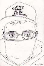
The theme being opposites I decided to draw zombies. hurrah.
I had a lot of time on my hands having had swine flu and all so i painted this. All in all I think it turned out really well. I particularly like the colours and tone I managed to work into it especially in the largest face of the zombies. I think the detail and layers of colour in amongst here are very effective.Anyway, so i have to add some opposites to this to make it appropriate for the project so here it is. A Valentines day card.
 I think this also works pretty well, the juxtaposition between the painting and the white space really exaggerates the differences between the concept and colour of the zombie painting and the script text and the flat bold imagery of the love hearts underneath.
Not that this has anything to do with the project whatsoever but as I said I had a lot of time on my hands and wanted to draw zombies. Used an old photo of me so this is essentially zombie me.

 These pieces were looking more at the opposites that I could find within media. The combination of found imagery of bodies and quite basic drawing I find quite interesting. I like the use of the ink dripping down the torso obscuring the face on the piece on the left. The piece on the right I introduced a comic element to by adding the sign in between the legs that says "open soon." I don't think that they are as effective as the zombie valentines piece as the concept isn't as well developed.
This piece was based around the opposites of opinion and reality. For instance the red blooded republican American has been inverted here. Instead of saluting the flag he is standing on it, and instead of its usual straight bold lines it is coming apart. The stars are also replaced with an obscenity. The image of the penis towards the bottom also further the obscenity of the image. The fact that the gun is emerging from the bottom of the organs with the classic Nixon tag line "I am not a crook," is symbolizing that the "American Dream" is comprised of lies. Finally there is the addition of the text "bulletproof" which is a comment about gun control in the US.
I think the use of the juxtaposition of space and paint is very effective here again, with only a couple of parts jutting out and breaking it up. The color is also very similar throughout, using mostly reds and oranges except for the small section of blues and yellow which really draw the eye to the important sections of the image.
 This piece on the right I don't really like, I think it is far too simple and the idea wasn't that great. Simply taking a well known phrase "an apple a day keeps the doctor away," and turning it on it's head. I think this could have been better if i had come up with a better way to represent it.
On the left however is a piece that I do like; a complete inversion of a standard typeface. The alphabet starts from the middle. The lower case are bigger. The hierarchy is a spiral, however in order to see the letters the right way up the viewer has to rotate the image in the opposite direction of the spiral. This leaves half the text reading left to right, and the other half right to left. I added the red spot to the middle to draw attention to the beginning of the sequence, I tried it with just a black space but it wasn't obvious enough to draw the eye in. I think that white on black was a good idea as it is another opposite to the standard.


No comments:
Post a Comment