Friday, 3 December 2010

Website Design Moves To Dreamweaver

So I took my Photoshop file, sliced it up with the slice tool and then opened it up in Dreamweaver and I've started adding bits of code and extra elements. I've managed to get it to stay centered in the middle of the browser whatever size you make it. Here's what I've got so far.

Design view of home page.

Preview in browser


CSS rules for text.
Super exciting stuff. Think it's looking good so far. I'm just having a little trouble getting the email link to follow the centering of the rest of the page. More code is needed it seems.

Thursday, 2 December 2010

Concert Photography Two

A further selection of gig photography.


Crafty Fox Collective presents The InCiders - (left to right) Alf & Cider Man. PR&R Is The Name Of Our Game.


Crafty Fox Collective presents The InCiders - Nick. Ground Zero.


Crafty Fox Collective presents The InCiders - (left to right) Nick & Alf. Bombs Bombs Bombs.


Crafty Fox Collective presents The InCiders - (top to bottom) Cider Man & Crowd. Game Over.


Crafty Fox Collective presents The InCiders - (left to right) Fox, Cider Man & Nick. Just Isn't Justice.


Crafty Fox Collective presents The InCiders - Fox. Operation Mayhem.


Crafty Fox Collective presents The InCiders - (left to right) Cider Man & Fox. Funding The Death Of Your Fellow Americans.
 

Crafty Fox Collective presents The InCiders - (left to right) Fox & Alf. Plan 136AAA Is About To Begin.


Crafty Fox Collective presents The InCiders - (left to right) Kevin. Blood Will Run In The Streets.

Concert Photography

Many people may not know, but in some of my spare time, which has decreased significantly since returning to uni, I like to take photos. In the summer I did a fair few local gigs with my camera but didn't have photoshop at the time. Now that I've gained that tool I have edited up some of the better photos.


Atomic Legdrop presents Thunderdump. I don't know this guys name. He's pretty big though.


Atomic Legdrop presents Parttimers - (left to right) Dan & Jose. Acoustic Hip-Hip is a winning combination.


Atomic Legdrop presents Parttimers - (left to right) Dan & Jose. Getting down with Hip-Hop arm movements.


Atomic Legdrop presents Parttimers - (left to right) Hans, Dan & Jose. Crooning.


Atomic Legdrop presents Parttimers - Hans
 

Atomic Legdrop presents Parttimers - Dan


Atomic Legdrop presents Double Cross - (left to right) Sully & Alex


Atomic Legdrop presents Double Cross - (left to right) Sully & Alex


Atomic Legdrop presents Double Cross - Sully


Atomic Legdrop presents Double Cross - Sully

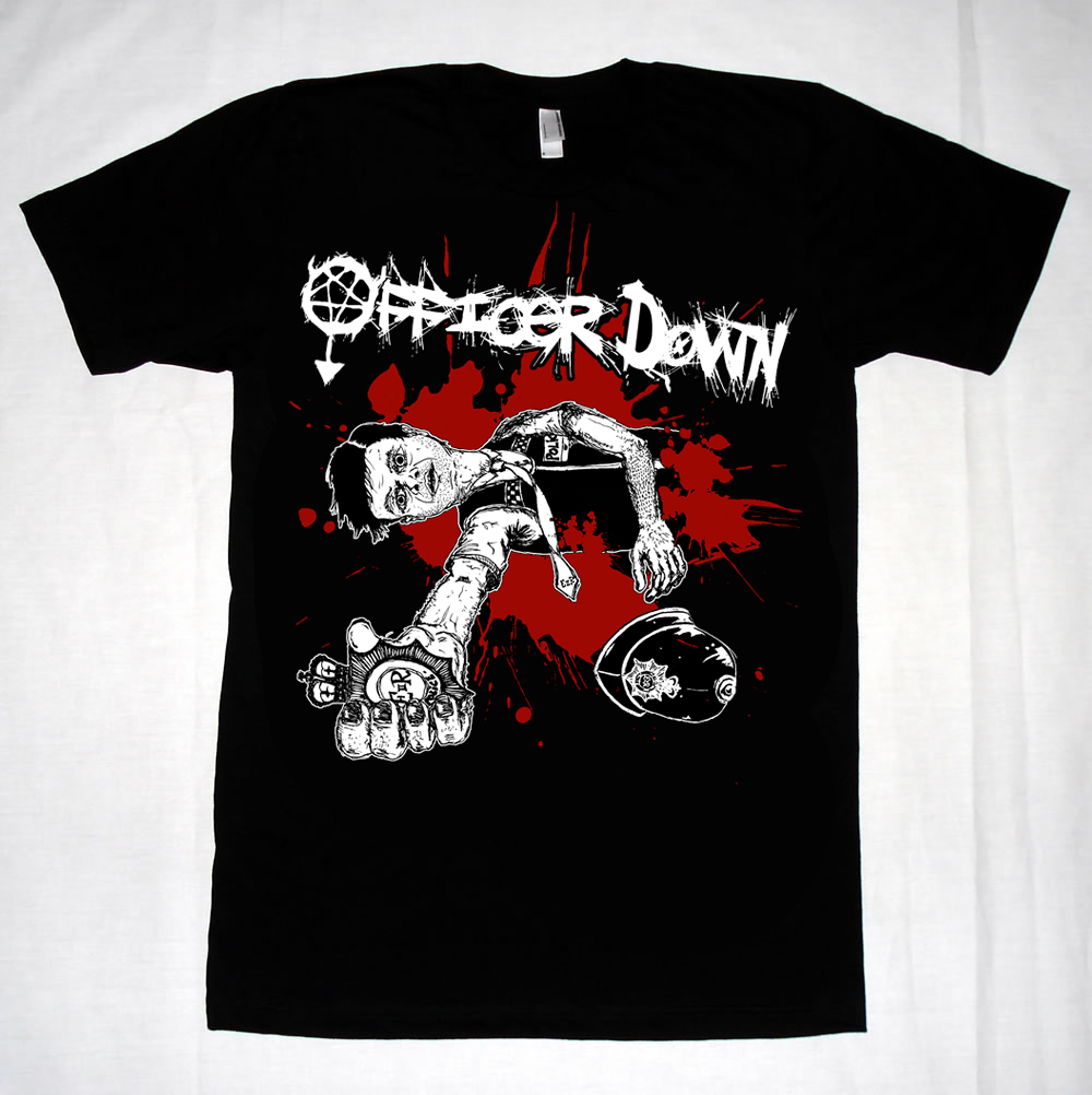
Officer Down Returns

So there was just a few more edits to do after sending the full piece off last time. Here's the final situation. The city scape has been cut completely and were down to the basics. Dead cop + blood. Fair enough. T-shirts coming soon.

December 2nd 2010: In The Land Of The Felines...

Coming soon to a cinema near you.
In a post-apocalyptic wasteland, one dog's struggle to overcome the odds and be reunited with his family is hampered by peril. Accompanied only by his pet rat, Bruno must fight for survival and outrun the pack of evil cats that are close on his tail. Toxic waste and the bones of old friends fill the streets while vulture circle hungrily overhead. Will Bruno make it? Will he reach the biscuit factory in time? Or will he succumb to the trickery of the cats, and be lost forever to the morose world that has become... The Land Of The Felines. Directed by Ben Mercer. Staring Will Smith as Bruno, Ross Kemp as RatBoy and Bono as Ginger Tom.

"Heart wrenching... I've never cried so much" - The Tymes
"A glorious story of the overcoming of odds and slapping those cat b*****ds" - Daily Telephone
"Will Smith gives an amazing performance... undoubtedly the best film of the year" - Will Smith

Rated 15 by the British Film Association. Contains strong violence, bad language, drug use and scenes of a sexual nature throughout.

Wednesday, 1 December 2010

Screen Based Communication: Website Portfolio

The new unit started last week but I didn't really have anything to post as it was all just doing research, doing some scamps and general idea generation. The new unit is about designing and creating an effective, original & interesting portfolio website. As such I've been having dreamweaver tutorials which are going swimmingly. So after the first section which involved a lot of writing, it was time to do some design. The first thing I chose to do was to create a header of my name to go at the top of my site. I wanted it to be hand rendered (suprise) so that it was reflective of my work & my personality. Secondly I wanted it to be quite simple and natural, not overly complex or intricate, certainly nothing decorative.


After writing my name about 100 times in different ways I chose four, scanned them, cleaned them up and then live traced them, and then messed about with the threshold & min area for ages. I got these four. The first and second are done in a Faber Castell brush pen. Number 3 is done with a paint brush and ink. While option 4 is a 08 unipin. I didn't like the third one outright so that was gone, it was too much like the second one, but not as good because it didn't flow well enough. The second one itself I do really like but I though it looked a little bit graffiti style (feel free to correct me) which really isn't anything to do with my work so I cut that on out. Number 4 I really like, so simple and niave, very reflective of my work, so I tried out that & number 1 out and found that number 4 simply didn't have enough punch to be a header. So after about an hour of faffing I managed to cut it down to the top option there. Which was roughly the third or second one I wrote. Out of 100. In my normal hand writing. Time well spent. The 'B' at the bottom I just picked out of one of the times I was writing it because I really liked the way it looks, how curly and flowing it is so I though I'd make it a vector and use it as an ident.


Seeing as how I liked the other option so much but it was cut due to weight issues, I decided to use that style as the option for my buttons within the page, which don't need to be so weighted. I think the two styles fit well together, one is very flowing whilst the other is quite stunted and jagged, but both very loose & clearly hand rendered even though they've been vectorised (I'm not sure that's a word... made into vectors anyway).


I have a logo now.
Heres the first basic page of my website. It doesn't quite work as it should when it's shown here as it's a white box with a drop shadow, sat on a white background. Which is obviously whats happened... but it's supposed to sit within & take up an entire browser, not be left to float in the middle of a blog post. I'll try and make a photoshop mock up or something for the next post. I think this has worked really well. Simple, effective design. Interesting typography. Good layout. The name of the page is going to sit between my name and the logo at the top, and then the content evidently will be in the middle section. I'm not so sure about the lines though. I may remove those and just have whole thing very open and basic, I think they might be a little jaring once the content has been added. More to follow.

December 1st 2010: Faceless Bird's Nest Girl


Woah. Apparently it's December already. I'm gonna get all retrospective now. I can't believe 2010 is almost over. Seems like it's gone by really fast. Only another 30 drawings after this one and then I'm done. That makes me feel a little sad. I've really enjoyed this project. I doubt I'd be able to keep it up for another year though. I think next year I'm still going to draw every day. But I will be working on larger illustrations and dedicating more time to each one. Hopefully that works out. Anyway. This girl has no face but she does have birds in her hair.